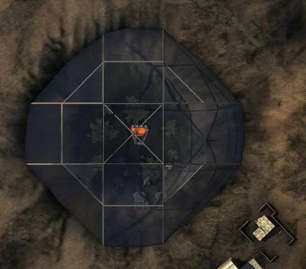
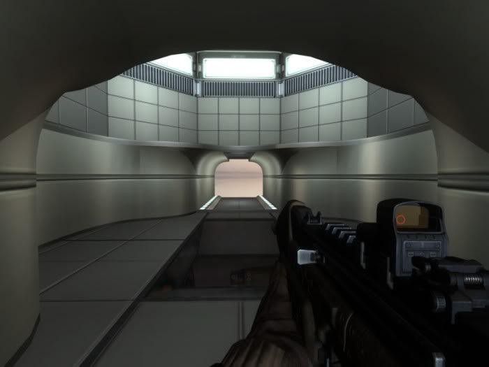
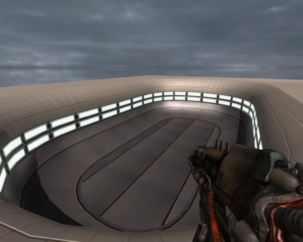
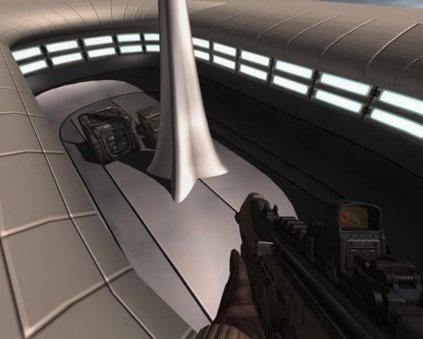
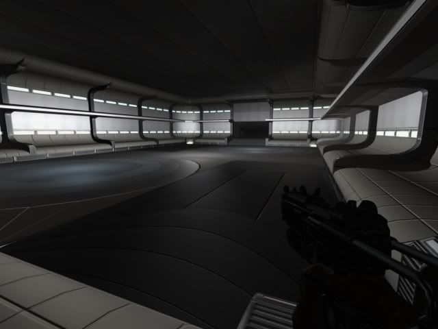
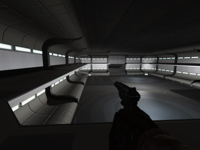
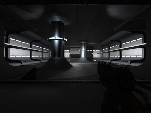
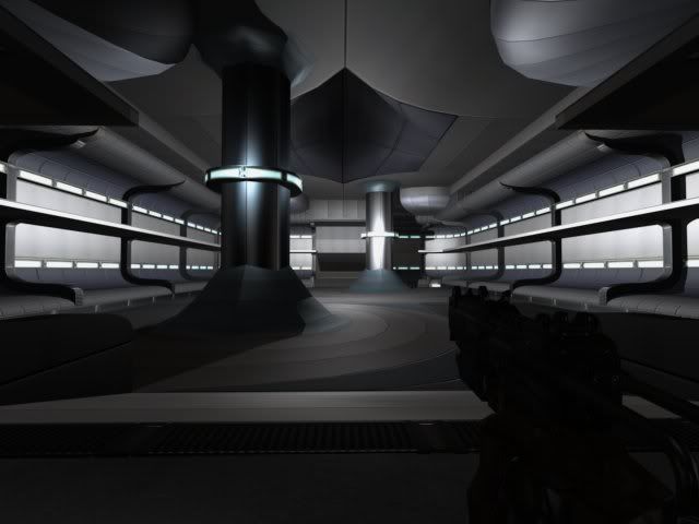
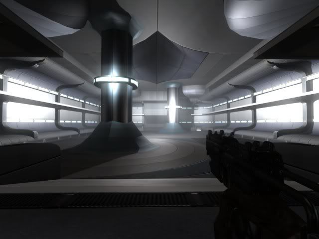
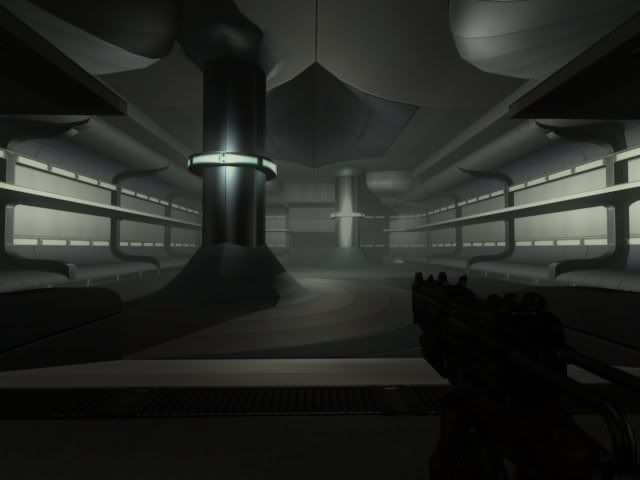
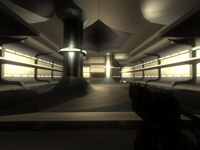
nice view. Which room is it? Spawn in castle? The windows/balconies on all floors of the castle might be a great idea, to have a view/blick of the landscape when fighting inside. Could benefit the map feel/atmosphere. Especially because the surroundings are pretty.
Glory of the Weak - Work in Progress
This is the old_dark_room_were_chris_asked_“donn_dont_know_how_to_use_ambient_lights?_”.
Another image, now from the Ambient Ocllusion implementatin on the megatexture:
You can see the “traped” areas have less light due to difficult of ambient light to reach it generally.
Thanks COLDCOOKIEWEAPON!
HERE THE RELEASE OF GLORY BETA 3!
Map checksum is: 0x65dd0ce3
Link to download: http://code.google.com/p/glory-of-the-weak/downloads/detail?name=zz_glory_b3.pk4&can=2&q=
Changes on Beta 3:
> Redone third objective:
- New spawn times.
- New strogg spawn point.
- Roons remade.
- Entrances remade.
- New Minecraft server spawn position.
- Added capturable Strogg Spawn.
> Bot Work:
- AAS recompiled.
- Added Bot Routes.
- Defenders plant mines.
> Small layout changes:
- Created various new kind of access.
- Small visual changes.
- Changed some big shapes layout.
> Improved megatexture.
Hope you like it!
Map Source can be found here: http://code.google.com/p/glory-of-the-weak/
Thanks! The map have bots!
I would like to know if anyone have interest in future updates of Retake of the Andes, Construction Site and Glory of the Weak. Have you?
Thanks!
Tbh, i think Andes is good as is and Consite is beyond any help (unless you wanna be brave and change the layout significantly, whilst actually listening to the feedback of other mappers). And Glory updates would be nice, yeah.
Just blows my mind Donnovan, we are definably gonna use this style for the little thingy we are working on 
This a new map?
If not you should really consider just making a new map instead of radically changing the same 2 maps (consite, glory), I can’t really see how this style would work in the context of the map as it stands, a nice crisp clean white facility in the middle of the desert?
Also to avoid the distortion on the corner cruves, the texture repetition should be equal to the patch subdivision, this will get rid of the squiggly lines.
Thankyou guys!
Chris! This is nice tip! Thanks a lot!
Edit: Here! Fixed the zig-zaf lines doing what Chris sayd!
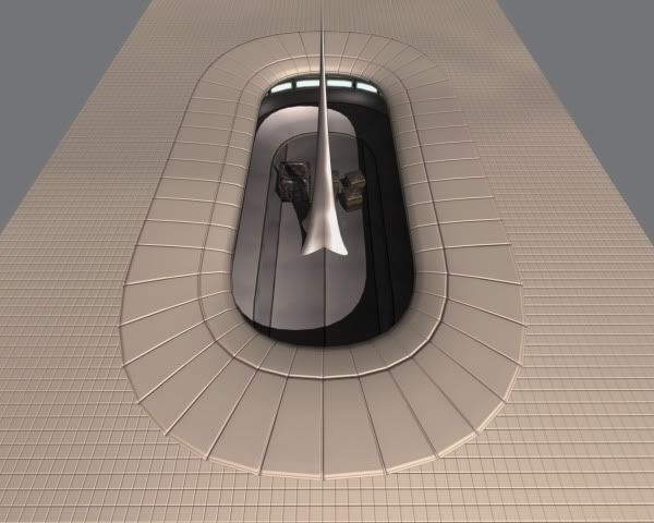
If i am correct ‘fabulous’ is the right word. The cloud shadows just make it look there a bumps in the material.
Jup, as Chris said it would be better to start 2 new maps don, but maybe you are just showing some stuffs that wont get included in your maps but are for another project?
A brink’ish map on one side, battery on the other, and you have 2 new maps there 
Keep up the work, reinstalling soon to test it out!

