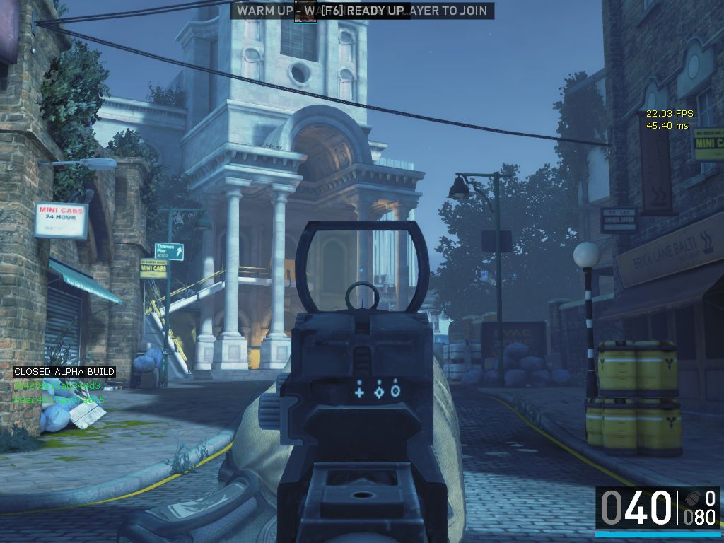
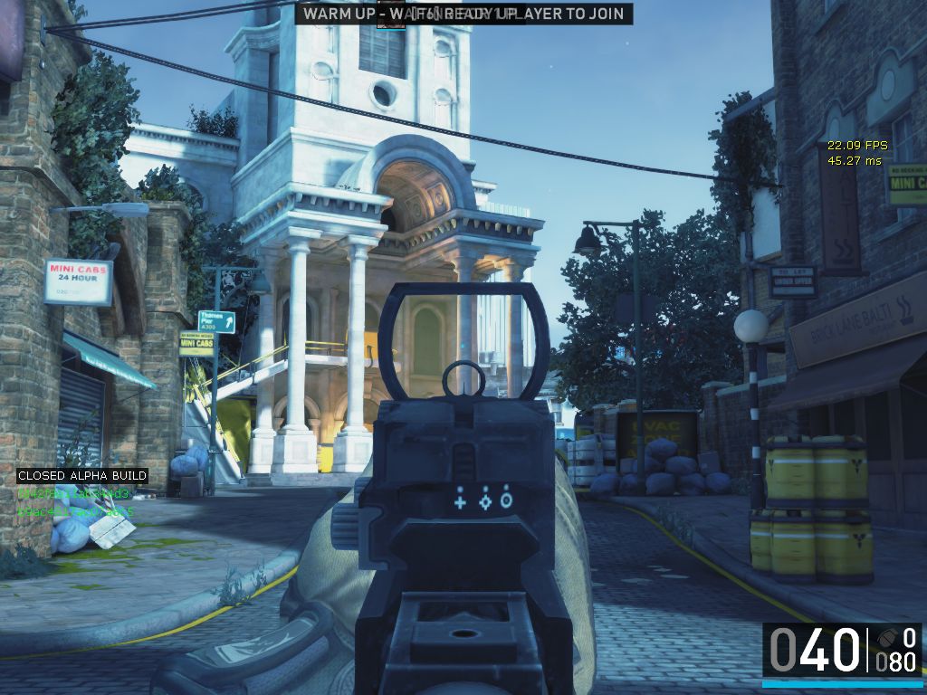
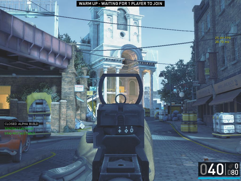
nice news !
Why do the colors in Dirty Bomb look washed out?
[QUOTE=Fluffy_gIMp;453962]London Bridge is where you’ll be starting to see changes, however there has been more done that hasn’t yet been committed to the version you are playing.
We are address things like you guys have been mentioning: increasing the saturation (colours), reducing the fog and brightening light sources.
From what I understand (dev guys please correct me if I’m wrong) work is focused on getting a benchmark with London Bridge first, before going onto the other maps.[/QUOTE]
Thanks for the feedback guys. Just watched another UT3 engine game, Smite, go through some art passes and you can tell the difference a little bit of polish makes. In their case, a complete art asset overhaul.
Good, I remember reading in another thread that is looks like smog because you haven’t completed doin whatever you guys are doin. Happy to see it will get cleaned up and look a lot better because it drastically needs it.
It would also be weird. I know it’s a different engine (a better engine then the Idtech iteration they were using for Brink) but Brink looked really good actually and had fantastic visual style. Currently in Dirty Bomb as a player who’s just looking for a good fps game, just looking at a current screenshot would them just go bleh “average looking fps game, moving on”. If you look at games like Mass Effect 3, Smite etc you notice that you can do a lot with the engine visually.
but because there isnt a good fps game even this person give it a shot, except he plays arma lol
I’ll give you idtech 4 but I’ve seen way better games on idtech 3/5 (mp wise) that ue3 can not compete with. Actually I can’t think of any good mp game on the ue3 engine.
I haven’t read the 5 pages, but I like the desaturated colors (I do really prefer the original pic over the more saturated one)
My only gripe with graphics in this kind of game is when things are too sci-fi & not easily identifiable. For ex, I find it easier to remember a path if there are things I can identify like “a bunker at the end of the beach”, “a theatre”, “a store with an original sign”. In a lot of today’s game it’s uninspired sci-fi & pretty much everything is “a shiny corridor filled with crates & wires”, like there’s no place where people live.
& on this side DB is quite ok. Sometimes 2 places look a bit too similar but it’s still ok. Brink, while looking very original (I love the style, I prefer it over DB’s), kinda has this “I’ve seen this place before, not quite sure where I am” problem.
Maybe “events” could also help here, like a very windy outside opposing calm indoors, rain starting at some point of a map, I don’t know…
Looks cheaper? Care to explain? Because the fog looks cheaper. Most ****ty made games come stashed with an atmosphere I can’t see my enemies so I beg to differ.
you won’t see your enemies better if the whole thing is more contrasted, you’d only see them better if the enemies were contrasted over a non-contrasted background.
(besides it’s more motion than anything that helps spotting distant enemies)
Btw, I’m judging on a (really good) CRT, on my LCD it looks more washed out but so does everything, its an LCD…
CRT’s have faster response times, less ghosting, better colour range, proper resolution scaling and for the penalty of being slightly bulkier, I bet a lot of gamers prefer their CRT over LCD.
Give the man a cookie! I work in the flight simulation business and CRT projectors would still be the top choice for visual systems if they were not so heavy and damn expensive to maintain (like $30K to replace a set of tubes…:eek:).
The only things is view angle (which is barely a problem these days) and color range but I’ll trade that for a sharper image. ASUS has a near 1 ms response time monitor that you wouldn’t be able to physically notice the difference.
For anyone still using a CRT it’s time to upgrade your life. 
I absolutely loved my 2 CRT monis, pained me to lose them, replaced with a 24 LED and 2 x 22 LCDs lots of screen but colour depth was better on CRT (when new) unfortunately they got old and started to fade, still have them in my shop, can’t seem to part with them
thanks to whoever mentioned fogdensity 0 last night.
cant believe i missed that before. edit added PostprocessAAType 0 last pic.
[QUOTE=iwound;462120]thanks to whoever mentioned fogdensity 0 last night.
cant believe i missed that before.
[/QUOTE]
Thnx man! Looks a lot better now.
[QUOTE=iwound;462120]thanks to whoever mentioned fogdensity 0 last night.
cant believe i missed that before.
[/QUOTE]
Well if you are at it, try
PostprocessAAType 0
-1 would had been default. You can also increase it actually, I suppose -1 is same as 1… lol.
I add this bind in shooterinput, so I only have to press the button.
Bindings=(Name=“F9”,Command=“POSTPROCESSAATYPE 0 | BloomSize 0 | FogDensity 0 | TOGGLEMIPFADE”,Control=False,Shift=False,Alt=False,bIgnoreCtrl=False,bIgnoreShift=False,bIgnoreAlt=False)
Togglemipfade better leave out… lol.


