Why do the colors in Dirty Bomb look washed out?


(ImageOmega) #1

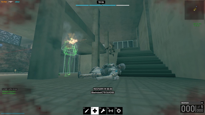
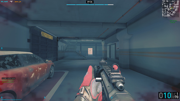
You guys have a fantastic art department that create some amazing concept art, skins, and textures. However, when all of these things are translated into Dirty Bomb all the colors appear lackluster and washed out. Why aren’t we getting the same vivid colors as the concept artists intended?

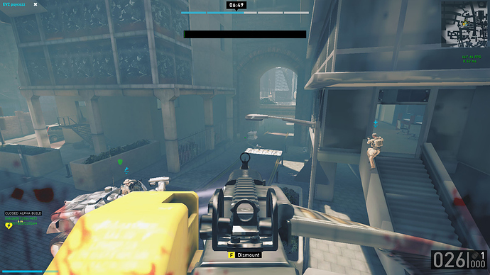
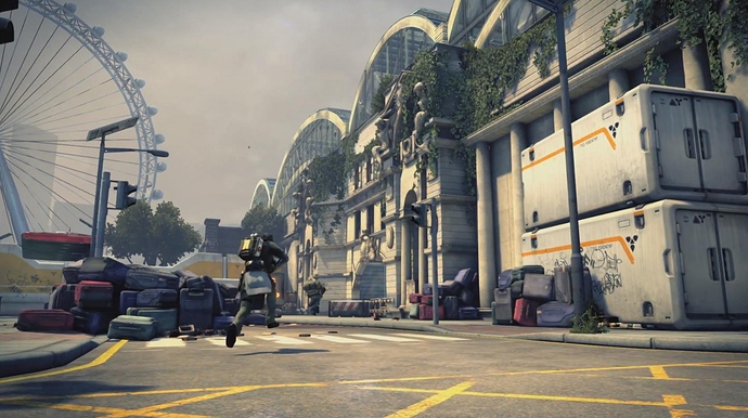
Here is a screenshot taken by Splash Damage:


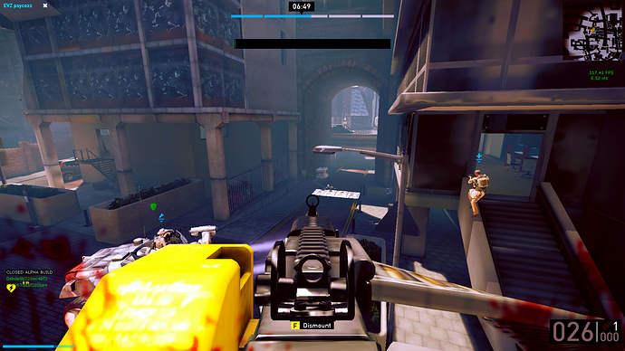
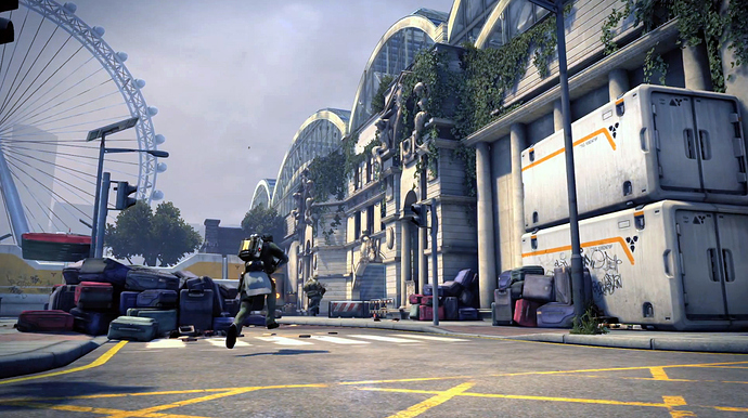
Here is the same screenshot, but ran through Photoshop’s “Auto Color”, “Auto Contrast”, and “Auto Tone” filters:


I think just doing some simple auto adjustments in Photoshop made a huge difference on that screenshot. I, also, know that I am not the only one that feels that way regarding the colors being washed out. I’ve seen it mentioned multiple times on the forums. As an FYI, I do change fogdensity to 0 in game, but that does not impact the washed out colors.

If Splash Damage can bring some vivid colors to Dirty Bomb I think visually it will be a lot more appealing, and thus, a lot more fun to watch (especially those showmatches).

(INF3RN0) #2

+1 contrast bar or overall increase.


(BomBaKlaK) #3

yep ! really needed ! I just try some parameters on my screen but that’s not enough.


(RasteRayzeR) #4

yeah, the game looks a bit cold in terms of colors.


(en2ie) #5

I thought it was deliberate to give off the “nuclear fallout” style - as with the fog too. But I would also prefer more vibrant colours and contrast.


(Samurai.) #6

yeah my game looks like im playing in colour blind mode with all the shades of grey. I believe it is slightly a result of turning down texture quality, high brightness levels, turning off certain lights and the lighting etc in the environment not being finished?

Either way the game needs way more digital vibrance (colour) by itself… i even have my desktop DV turned up to 100% to try improve things, but doesn’t have a massive impact on the overall look. Contrast bar would also be extremely useful.


(rand0m) #7

It’s the saturation in the lighting causing a “fog”. I guess they add trying to reach an “atmosphere” when in reality the atmosphere isn’t what the game needs and it sucks. All the MS videos the lighting and saturation seems perfect but then in game the lighting is just BROKE. I really hope this is looked at and fixed, I can never see models across the map which is why I assume you bandaided the game with these stupid “nameplates”. Well I have all that crap turned off and I can see why it was implemented. Please remove this saturation and ill honestly be more likely to play this game at release. The way it stands now ill get sick of it real quick. There’s nothing “next gen” about this fog…you can clearly see enemies in next gen games. I hope you guys remove this, if not, well then…

It’s not a “contrast bar” problem, it’s simply a lighting and environmental saturation problem created on the maps I assume to give the feeling of a nuclear weapon going off? But it hinders gameplay.


(AntOO14) #8

true all looks to much grey / depressed.


(chippy) #9

This. I don’t mind the actual thought behind it: giving it more of a run down look, but the way it’s implemented right now just doesn’t work. Hinders visibility and makes the game look quite bland a majority of the time. The only map right now that have the lighting sort of working is White Chapel in my opinion. There’s definately some sort of “fog” there, but I don’t personally don’t have the same issues with the colors and visibility with it on that map.


(rand0m) #10

London bridge, waterloo aren’t TOO bad, but Camden is just awful, white chapel is meh, but those retina burning lights need to face a different direction rather then in my line of sight, and the fog is there but needs to be removed a bit more. I’d like to see a lighting overhaul sometime within the next few weeks/months/milestones to give a sense of knowing its an issue. I have a feeling if game is released this way well then, it may become a huge issue further down the line.

I really suggest heading the warnings from the alpha testers now SD, because it seems to be a consensus that the map lighting is just awful.


(Runeforce) #11

Disable experimental DirectX, christ


(rand0m) #12

So this means what?


(chippy) #13

I have never turned it on to begin with.


(rand0m) #14

Yeah you have no clue what you are talking about, cause I never turned it on either.


(RasteRayzeR) #15

The single time I put this one on, the game didn’t even started lol


(Samurai.) #16

My previous post was based off memory, but after playing today again it really re-assured me how much of a significant problem these graphics really are. It is no short of rediculous how washed out/grey the setting is for me, and it really makes it difficult to spot and track enemies as well as aesthetically being unpleasing on the eye.

Some examples:

Grey Camden :


Grey London Bridge:


Then proceeded to do a few photoshop adjustments in no less than 2 minutes and although there is not much i can do with the fog situation, the general contrast and colours were improved to this which is by no means a “best” look outcome or anything just a slight improvement & to highlight the issue.


This really is a big issue that i think SD needs to pay more attention to than it looks like they are giving right now. We’ve had slight fog adjustments in 1 or 2 of the latest patches recently, but nothing major has happened which has actually proven to be a solution for any of the maps. They are all terrible in terms of colour/fog for no actual benefit in aesthetics or gameplay.

For me personally i prefer the bright clean day time maps… i think we got to see a version of White Chapel in the day time for the TDM version of it and for me everything seemed so clear and nice in the video… however i guess this always happens with the video rather than what we all actually see in game.


(ImageOmega) #17

Yeah, Samurai, that is all I did too. Well actually even less since I just used the auto adjustments. But, those minor adjustments made a huge difference!

What do you guys think of the before and after pic myself and Samurai posted?


(Jamieson) #18

[QUOTE=Samurai.;451568]My previous post was based off memory, but after playing today again it really re-assured me how much of a significant problem these graphics really are. It is no short of rediculous how washed out/grey the setting is for me, and it really makes it difficult to spot and track enemies as well as aesthetically being unpleasing on the eye.

Some examples:

Grey Camden :


Grey London Bridge:


Then proceeded to do a few photoshop adjustments in no less than 2 minutes and although there is not much i can do with the fog situation, the general contrast and colours were improved to this which is by no means a “best” look outcome or anything just a slight improvement & to highlight the issue.


This really is a big issue that i think SD needs to pay more attention to than it looks like they are giving right now. We’ve had slight fog adjustments in 1 or 2 of the latest patches recently, but nothing major has happened which has actually proven to be a solution for any of the maps. They are all terrible in terms of colour/fog for no actual benefit in aesthetics or gameplay.

For me personally i prefer the bright clean day time maps… i think we got to see a version of White Chapel in the day time for the TDM version of it and for me everything seemed so clear and nice in the video… however i guess this always happens with the video rather than what we all actually see in game.[/QUOTE]

That’s me in the E.V!

But on a serious note this does need improving. It’s not too bad up close but at greater distances it get’s really hard to spot and track enemies, especially on really long stretches like on LB after the first barrier whilst it (E.V) moves across the bridge.


(rand0m) #19

[QUOTE=Samurai.;451568]My previous post was based off memory, but after playing today again it really re-assured me how much of a significant problem these graphics really are. It is no short of rediculous how washed out/grey the setting is for me, and it really makes it difficult to spot and track enemies as well as aesthetically being unpleasing on the eye.

Some examples:

Grey Camden :


Grey London Bridge:


Then proceeded to do a few photoshop adjustments in no less than 2 minutes and although there is not much i can do with the fog situation, the general contrast and colours were improved to this which is by no means a “best” look outcome or anything just a slight improvement & to highlight the issue.


This really is a big issue that i think SD needs to pay more attention to than it looks like they are giving right now. We’ve had slight fog adjustments in 1 or 2 of the latest patches recently, but nothing major has happened which has actually proven to be a solution for any of the maps. They are all terrible in terms of colour/fog for no actual benefit in aesthetics or gameplay.

For me personally i prefer the bright clean day time maps… i think we got to see a version of White Chapel in the day time for the TDM version of it and for me everything seemed so clear and nice in the video… however i guess this always happens with the video rather than what we all actually see in game.[/QUOTE]

Yeah things are so clear on the tdm maps, why so awful on obj/sw? This is a great post and absolutely correct. This needs to be fixed.


(tokamak) #20

I like the limited palette. It’s just that it looks like trash on low graphics. I’d rather see more contrast and saturation on the low quality textures and keep the fancy atmospheres for the high end, very similar to WoW and Starcraft. Blizzard really understood that.