You have nameplates in wow and Starcraft. In an fps you don’t need that garbage.
Why do the colors in Dirty Bomb look washed out?
tokamak
(tokamak)
#22
That’s not the point though. From an aesthetical point of view it’s nice to have limited palettes, but once you start using lower settings then the limited colours become really gross and grim. The intended mood gets lost. Camden on low settings looks really, really depressing. Not romantic rustic, no, just ‘/kill’ depressing.
Blizzard understood that and makes the low settings really saturated so everything remains vibrant and cartoony.


Rex
(Rex)
#26
Camden:


I agree with you guys, I’m absolutely not happy about how it looks at the moment. We need more contrast!
rand0m
(rand0m)
#27
Thanks for that Rex. This is also the problem with why we can’t see player skins/models and the reasoning for adding these LED lights on them. Hope this is being worked on and looked at…
ImageOmega
(ImageOmega)
#28
Good work, Rex.
It’s almost as if on every single picture you’re just removing a layer of white that’s blanketing the image at 20% opacity. Also, the colors are popping way more! Some of them it looks like there’s less green. The only one I have an issue with is that final Camden shot because it looks like it’s over-saturated with red.
rand0m
(rand0m)
#30
Dunno if that’s gonna be the problem though, bombaklak. It could be, but it could also be coded into the map itself to have that atmosphere. Either way a fix is needed.
acutepuppy
(acutepuppy)
#31
No question on what looks better, and that UE3 can support very beautiful high contrast lighting. There is no reason to retain this fog.
tokamak
(tokamak)
#33
The high contrast is indeed more clear but it also looks cheaper. I prefer the fog.
Except for Rex’ rendition of Camden, that looks lovely.
FROST1
(.FROST.)
#34
I also prefer it, when the visuals are a bit crisper. I think Brink was allready too hazy. Even from the first gameplay vids, I saw on YT, I thought, that Brink was too foggy. I remember when I had used the “noclip” command for the first time; when you “fly” through walls, the ground, or up high, the fog will disappear and everything looks like I’d have liked it in the actual gameplay. DB, however, seems to be even foggier than Brink. I think a reduction of 50% fog-density would allready be good enough.
Dragonji
(Dragonji)
#35
I completely agree with OP, the game definitely needs some “life” in terms of colours!
How about letting a player change everything as he wish?
So tokamak can keep his “fancy atmosphere” and other players can enjoy vivid colours in these depressing times 
rand0m
(rand0m)
#36
[QUOTE=tokamak;451626]The high contrast is indeed more clear but it also looks cheaper. I prefer the fog.
Except for Rex’ rendition of Camden, that looks lovely.[/QUOTE]
Looks cheaper? Care to explain? Because the fog looks cheaper. Most ****ty made games come stashed with an atmosphere I can’t see my enemies so I beg to differ.
ImageOmega
(ImageOmega)
#37
Haha! I was talking to Valdez about this thread and I knew one person was going to say they preferred the original drab color palette. Predictable who was as post history indicates the trend. =]
tokamak
(tokamak)
#38
Yeah that´s great. All I´m saying is that the highest quality settings should be this whole washed out fancy atmosphere and the lowest quality settings should be saturated cartoony and most of all, clear.
Well if being able to discern your enemies is the only thing where you´re evaluating the aesthetics by then I can understand why you consider it cheap.
ImageOmega
(ImageOmega)
#39
Just giving you a hard time tokamak. Where would this forum be without tokamak posts? ;]
While maybe not a just comparison, please consider these Mass Effect 3 screenshots (another Unreal Engine 3 game) as a way to provide both bright, vivid colors and atmospheric fog at high quality settings.


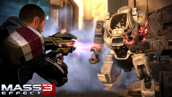

And, look! That last one is London and fog! Haha!
Again, maybe not a fair comparison, but at least it shows what the engine can do. Right now there just seems like there is a filter over the entire game’s visuals.
rand0m
(rand0m)
#40
[QUOTE=tokamak;451671]Yeah that´s great. All I´m saying is that the highest quality settings should be this whole washed out fancy atmosphere and the lowest quality settings should be saturated cartoony and most of all, clear.
Well if being able to discern your enemies is the only thing where you´re evaluating the aesthetics by then I can understand why you consider it cheap.[/QUOTE]
Sorry this is a FPS. You need to see your enemy. Simple as that.