Several of these things aren’t bugs in the strictest sense, but rather requests for minor changes. Some of them are redundant (i.e. other people have posted them)–I think this is appropriate so that the overall desire for a change can be gauged.
[ul][li]The empty space on the left being used up by the title graphic is a bit annoying… While I’d probably get used to this, it is (IMHO) mostly wasted space. Everything feels shifted to the right, especially when the logo itself is no longer visible because you’ve scrolled past it. I think it would look nicer if (after the forum index, at least–although phpbb’s templates didn’t really offer a way to differentiate, iirc) the left of the logo was cropped off.
[/li]Example:
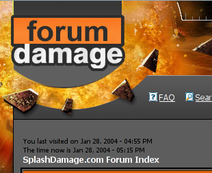
[li]The ‘Forum Damage’ logo used to be a link to the forum index–it’d be cool if it became one again.
[/li][li]The ‘new posts’ icon on the front page is very similar to the ‘no new posts’ icon–a little more contrast would make it easier to see whether there are new posts.
[/li][li]The aspect ratio on some of the icons in the thread list is wrong, so they look awful.
[/li]Example:

[li]Some of the buttons still have a few white pixels around them (a hack from the original subsilver theme, which actually had a white background)–it’s just a minor thing, but it’d look nicer if the edges were fixed.
[/li]Example:

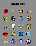
[li]The emoticons are all squished to the same size in the message composition window, so the larger ones don’t look right at all.
[/li]Example:
[li]In Mozilla-based browsers, the radio/check boxes are shaped strangely (probably in relation to the font being used beside them.)
[/li]Example:

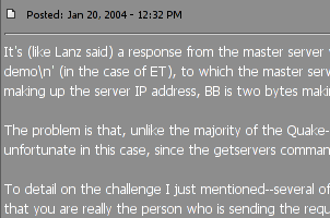
[li]I realize you can’t please everyone, but the white text is difficult to read on the lighter of the two backgrounds (at least for me.) Perhaps darkening the lighter background would be a reasonable compromise, as far as readability.
[/li]Example:
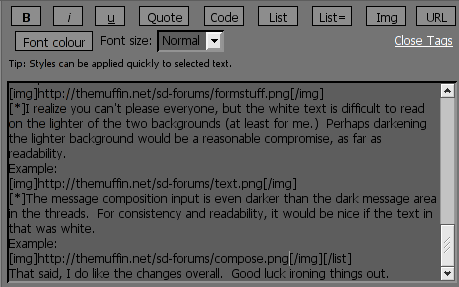
[li]The message composition input is even darker than the dark message area in the threads. For consistency and readability, it would be nice if the text in that was white.
[/li]Example:
 [/ul]
[/ul]
That said, I do like the changes overall. Good luck ironing things out.
[edit] Here are a few additional things I noticed:
[ul][li]Links within posts aren’t distinguished from normal text (no underline or alternate color), so it’s difficult to see where they are when they’re given a title.
[/li]Example:
This part of the text is not a link but this is a link.
[li]Posts no longer have a named anchor associated with them. With the old forum code, one could link directly to a given post by using a named anchor to the message ID of a certain post, e.g. http://www.splashdamage.com/forums/viewtopic.php?t=4578#39663.
[/li][*]I’ve experienced some session weirdness as others have described–the forum failing to remember my login info (even if ‘remember me’ is checked), seemingly random logouts, etc.[/ul]


 I had saved a lot of threads from the Editing ET forum and they no longer work. Keep getting the error:
 but the page is a mess when viewing it with Opera. As the other guys mentioned it before: no horizontal scrollbar and the button font is not readable


 [/ul]
[/ul]