Feedback Wanted: Dirty Bomb's Updated Look


(badman) #1

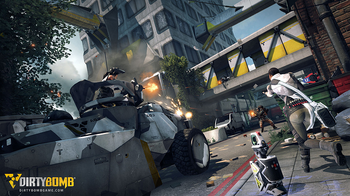
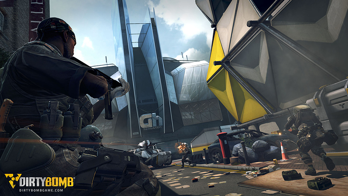
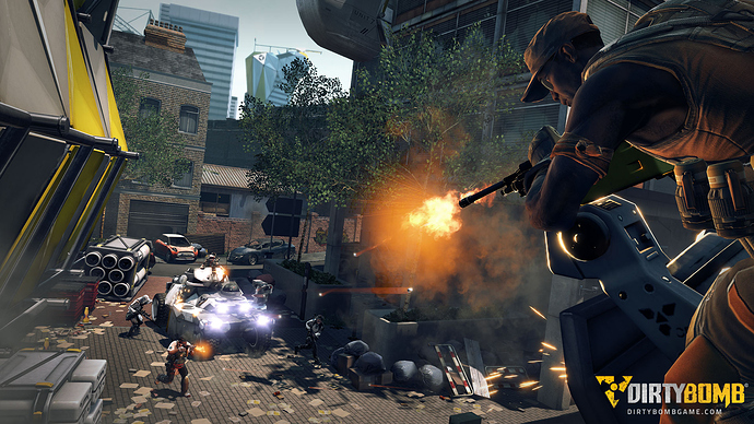
Based on all of the feedback we’ve had over the past few weeks and months, we’ve been tinkering with the atmosphere settings in the game to create a look that helps the characters stand out more.

vahl already showed some of this stuff in a different thread a few days ago, and now London Bridge is the first map to have gotten this treatment on our end. We’ve created a few new marketing screenshots to show it off - have a look at them below and let us know what you think!


(Hundopercent) #2

[QUOTE=badman;455609]Based on all of the feedback we’ve had over the past few weeks and months, we’ve been tinkering with the atmosphere settings in the game to create a look that helps the characters stand out more.

vahl already showed some of this stuff in a different thread a few days ago, and now London Bridge is the first map to have gotten this treatment on our end. We’ve created a few new marketing screenshots to show it off - have a look at them below and let us know what you think!


[/QUOTE]

Atmospherically speaking it looks a lot clearer and vibrant. It is a screenshot though and it’s not first person. In order to give you a real opinion I would need to see it in-game. Though it looks promising.

It still seems difficult to decipher who is on what team though.


(MrFunkyFunk) #3

How much was retouched? Kinda hard to judge marketing screens imo.
Overall they look nice.


(Volcano) #4

they look nice but i would prefer to see first person view shots


(Humate) #5

looks fantastic badman, well done.


(badman) #6

[QUOTE=MrFunkyFunk;455619]How much was retouched? Kinda hard to judge marketing screens imo.
Overall they look nice.[/QUOTE]
They are posed in the engine using in-game animations, assets and lighting, but we don’t build our screens in Photoshop or anything.


(Ashog) #7

Did I just see the colours got juicier? Looks nice and almost crispy.

I hope they will not get too juicy since the barbie colours will distract from the gameplay (remember that annoyed feeling after I first tried Quake 3 after Quake1/2).


(Wezelkrozum) #8

EDIT3:
Oke, got things cleared up. My config files broke the games look after the last patch. Sorry guys! Here are the right comparisons: http://forums.warchest.com/showthread.php/36819-Feedback-Wanted-Dirty-Bomb-s-Updated-Look?p=455657#post455657

EDIT2:
I can’t find anything wrong in my lighting settings so i guess this is the actual look of the current build.

EDIT:
It looks like there is something wrong with my lighting. Will get back to that.

Original message:
Here are screenshots of the current distributed build to compare:


I must say that if the promotional shots doesn’t have to much CGI the next patch looks really promising. But comparing the actual screenshots to the current build it looks like there have been added a lot of assets like containers etc to make it look more interesting.

But one thing for sure, the game is a lot clearer in sharpness and more vivid!


(rand0m) #9

So during team games are premium skins gonna be the norm? I see in those screenshots different colored players white medic and orange other players? How the **** will I low who is on my team? Now I’m forced to play with IFF and name plates? I really hope not. If your giving premium outfits better give me force model option cause I refuse to play an enemy team that is all different colors each player.

On topic: colors look much better, but they always look better in the screenshots and video reveals for milestones, ill believe it when I see it in game.


(Hundopercent) #10

[QUOTE=Wezelkrozum;455626]Here are screenshots of the current distributed build to compare:


I must say that if the promotional shots doesn’t have to much CGI the next patch looks really promising. The game is a lot clearer in sharpness and colorness![/QUOTE]

Why are your screens so dark? I dont believe my game looks like that and Im running lightboost.


(Wezelkrozum) #11

EDIT3:
Oke, got things cleared up. My config files broke the games look after the last patch. Sorry guys!

EDIT2:
I can’t find anything wrong in my lighting settings so i guess this is the actual look of the current build.

EDIT:
It looks like there is something wrong with my lighting settings. Get back to that.

Original message:
This is the default brightness of the game (2.2). But everybody is playing with a higher brightness. For example I play with a brightness of 2.7 because it’s too difficult to see anybody at the default settings. And I’m gonna tell you I’ve set every possible video setting to High to prevent further rumors :tongue:.


(INF3RN0) #12

The SS look great. Won’t need glasses for the next patch :slight_smile:


(potty200) #13

Colour! Wow, a much better look I must say. Really nice screen shots, will be nice to see how it actually looks in game without the washed out colour look everywhere!

Telling who is on who’s team looks to be a pain in the arse with these screen shots though.


(Vahl) #14

[QUOTE=rand0m;455627]So during team games are premium skins gonna be the norm? I see in those screenshots different colored players white medic and orange other players? How the **** will I low who is on my team? Now I’m forced to play with IFF and name plates? I really hope not. If your giving premium outfits better give me force model option cause I refuse to play an enemy team that is all different colors each player.
[/QUOTE]

plan so far is attackers bright, defenders dark, the current patch is slightly extreme, but this will stay along those lines in terms of contrast between teams, color will not be relevant to team ID.


(Vahl) #15

[QUOTE=Wezelkrozum;455626]EDIT2:
I can’t find anything wrong in my lighting settings so i guess this is the actual look of the current build.

EDIT:
It looks like there is something wrong with my lighting. Will get back to that.

Original message:
Here are screenshots of the current distributed build to compare:


I must say that if the promotional shots doesn’t have to much CGI the next patch looks really promising. But comparing the actual screenshots to the current build it looks like there have been added a lot of assets like containers etc to make it look more interesting.

But one thing for sure, the game is a lot clearer in sharpness and colorfulness![/QUOTE]

the promo shots are from an internal build from a few weeks ago, the media team has for ethics to not touch the screenshots in PS once they are taken.
However, your screenshots worry me, are you removing dynamic lights in the ini file ? because that’s definitely not normal. your textures are very low res too.

(tokamak) #16

Aesthetically it’s less interesting but now it definitely looks more like Quake Wars.


(en2ie) #17

Colours look much more vibrant, and the shadows look much darker - so that’s an improvement in my book. The view fogging might be reduced too, but it’s hard to really appreciate the difference through this sort of screenshot - I would prefer just a standard first person shot.


(rookie1) #18

Sure the marketing SS looks great ,will have to compare like Wezelkrozum did if ingame is still the same…i doubt it


(badman) #19

[QUOTE=badman;455609]
vahl already showed some of this stuff in a different thread a few days ago, and now London Bridge is the first map to have gotten this treatment on our end.[/QUOTE]
Emphasis added. :slight_smile:


(MrFunkyFunk) #20

Ok thank you!
I can’t afford that level of details but it looks awesome ;p