Dirty Bomb HUD Mockup


(ImageOmega) #1

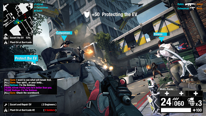
This has been something I have wanted to do for a while. Glad I could finally get it done! I put together a mockup just showing off some ideas I had for the Dirty Bomb HUD. Obviously, it is very rough, and based off what they already have in game. I just wanted to show off some slight differences and humbly add my two cents as the HUD gets changed further.

I’m excited to see the latest “changelog” and the news that the in-game HUD is getting more and more passes as updates roll along. The purpose of my mockup here is not to say this is exactly how it should look, but more so just inspire some ideas and discussion.

About the MockUp

The size is NOT to scale. This is not the direct size I’d intend to see. Also, not every single piece of information is meant to be the real mockup, but more so inspire more ideas about what could be on the HUD without going overboard and really cluttering things up. I prefer simplistic, but informative, and everything can be condensed to better suit this idea.

In the upper left we have the mini map with the yellow representing the player’s pov and green arrows representing teammates. Red are obviously enemy. The blue box is actually an icon supposed to look like the EV as to showcase its presence on the map. The small blue medic circle is to represent the healing station directly next to the player.

Below the minimap we have some game objectives and their progress. I actually had this idea to do the game progress in this style back when there was that single progress bar at the top center. I think attaching it to the mini map (which is now top left) would give a central space to look. I actually always miss chat in the top left… I feel like that’s the worst place to put it. Same thing happens to me in BF3.

Next to the minimap we have a Squad! Yes, someone posted about this before and I’d love to see this happen. I’d like some sort of indicators on my screen showing where my squadmates are at all times, even though I’ve not implemented this on the mockup per se.

In the bottom left we have the chat box and class specific objectives. My goal in doing these objectives is kind of MMO-esque where it shows you what needs to be done and what classes are needed for it (as indicated by the icons). Also shown is how many are currently playing that class and if none, then the number is shown in red.

In the top right we have the standard kill messages. And, in the bottom right we have the health and ammo information. The idea for how medic packs are displayed came from the player who mentioned he was colorblind (Mustang?) and said that having separate boxes to denote how many of each pack he had would be a little more helpful to see at a glance. The first box is gray, because you have 1 medic pack, the 2nd one is recharging, and the 3rd one is empty. I wouldn’t mind medic and/or ammo packs recharging independently of each other. Of course this bar can be retooled for whatever class ability.

Ammo is slightly redone to show an icon for what those numbers represent and grenades are now displayed via an icon with a count. Below that is a health bar similar to what is in game now, but the kicker is the actual numbers displaying specifically how much health you have left (number or percentage).

Across the center of the screen we have the traditional nameplates with Dawes showing damage taken. Also there is a bubble representing the EV needs protecting opposed to the giant, bright yellow diamond. Above the action is a notification that you gained XP with a shield for an icon. I like this above the action placement for such announcements as opposed to covering your screen.

That’s about it, I believe, let me know if you have any questions and again: this is not intended to be true to size or have everything integrated for a HUD. Just ideas to inspire in a visual format. I prefer simplistic, but informative.

Thanks for reading!


(Evil-Doer) #2

Damn Image, that’s freakin nice.


(INF3RN0) #3

I see you put a good amount of work into it so I wanted to leave you some feedback- can’t give you any rep points since apparently I am too frequent of a donor lol.

Likes:
-Ammo/HP/CD HUD. This is something that I would find much more informative. I bet you could reduce the size even more by converting the tool c/d bar to a vertical format on the left or right of that info box. Also is grenade count that important to increase the overall size? I bet you could minimize the space further and still make it clear.

-Minimap display color coding

-Fireteam; but how do we see their HP?

-Friendly HP display (see suggestions though)

Dislikes:
-Clutter; not scale, but just some further simplification would help overall.

-minimap location (I think it works best in the bottom of the screen where your least likely to have it block potential targets)

-team obj class info; audio cues might be a better way of doing it. I’d rather hear “we need a soldier or we need an engineer” or even “get X class on that obj already soldier!” types of global audio notifications. And of course have it in the tab screen.


Suggestions:

-Integrate as much information that you don’t need displayed all the time into the tab scoreboard; obj info, class info, etc.

-Combining the team icons (triangles) and hp displays into one entity would be better.

-Simple symbols and global audio cues in place of text wherever possible. Also maybe you could find a way to display more info on the minimap rather than a separate box.


(Hundopercent) #4

[QUOTE=ImageOmega;459924]This has been something I have wanted to do for a while. Glad I could finally get it done! I put together a mockup just showing off some ideas I had for the Dirty Bomb HUD. Obviously, it is very rough, and based off what they already have in game. I just wanted to show off some slight differences and humbly add my two cents as the HUD gets changed further.

I’m excited to see the latest “changelog” and the news that the in-game HUD is getting more and more passes as updates roll along. The purpose of my mockup here is not to say this is exactly how it should look, but more so just inspire some ideas and discussion.

About the MockUp

The size is NOT to scale. This is not the direct size I’d intend to see. Also, not every single piece of information is meant to be the real mockup, but more so inspire more ideas about what could be on the HUD without going overboard and really cluttering things up. I prefer simplistic, but informative, and everything can be condensed to better suit this idea.

In the upper left we have the mini map with the yellow representing the player’s pov and green arrows representing teammates. Red are obviously enemy. The blue box is actually an icon supposed to look like the EV as to showcase its presence on the map. The small blue medic circle is to represent the healing station directly next to the player.

Below the minimap we have some game objectives and their progress. I actually had this idea to do the game progress in this style back when there was that single progress bar at the top center. I think attaching it to the mini map (which is now top left) would give a central space to look. I actually always miss chat in the top left… I feel like that’s the worst place to put it. Same thing happens to me in BF3.

Next to the minimap we have a Squad! Yes, someone posted about this before and I’d love to see this happen. I’d like some sort of indicators on my screen showing where my squadmates are at all times, even though I’ve not implemented this on the mockup per se.

In the bottom left we have the chat box and class specific objectives. My goal in doing these objectives is kind of MMO-esque where it shows you what needs to be done and what classes are needed for it (as indicated by the icons). Also shown is how many are currently playing that class and if none, then the number is shown in red.

In the top right we have the standard kill messages. And, in the bottom right we have the health and ammo information. The idea for how medic packs are displayed came from the player who mentioned he was colorblind (Mustang?) and said that having separate boxes to denote how many of each pack he had would be a little more helpful to see at a glance. The first box is gray, because you have 1 medic pack, the 2nd one is recharging, and the 3rd one is empty. I wouldn’t mind medic and/or ammo packs recharging independently of each other. Of course this bar can be retooled for whatever class ability.

Ammo is slightly redone to show an icon for what those numbers represent and grenades are now displayed via an icon with a count. Below that is a health bar similar to what is in game now, but the kicker is the actual numbers displaying specifically how much health you have left (number or percentage).

Across the center of the screen we have the traditional nameplates with Dawes showing damage taken. Also there is a bubble representing the EV needs protecting opposed to the giant, bright yellow diamond. Above the action is a notification that you gained XP with a shield for an icon. I like this above the action placement for such announcements as opposed to covering your screen.

That’s about it, I believe, let me know if you have any questions and again: this is not intended to be true to size or have everything integrated for a HUD. Just ideas to inspire in a visual format. I prefer simplistic, but informative.

Thanks for reading!

[/QUOTE]

Never cease to amaze me Image.

Personally, I would like to be able to toggle some of that on and off and reduce the size but over all informative without being intrusive.


(ImageOmega) #5

Roger that.

Thanks for the quick feedback, guys. I absolutely agree that the HUD mockup is cluttered. It’s not intended to necessarily have EVERYTHING, but to spark ideas. And, definitely smaller for sure.

For FireTeam health, I was thinking maybe name changes color based on status? Alive, dead? Almost dead?


(INF3RN0) #6

[QUOTE=ImageOmega;459932]
For FireTeam health, I was thinking maybe name changes color based on status? Alive, dead? Almost dead?[/QUOTE]

Something that worked in the past for example;

Name HP#

Green = 100hp
Orange < 100hp
Red < 50 hp
Black = Dead

Some sort of color coding like that might not even need the HP # value either after people recognized their meaning as well.


(MrFunkyFunk) #7

Ahah I see what you did with the nades there, subliminal nade count increase wink wink

Overall I really like it, that’s the kind of alpha % I’m confortable with, not something translucent for my status/abilities and the minimap as we have atm.
That minimap is what it should be in-game because at the moment, as far as I’m concerned, I might as well stick a photo of my pet over the map on my screen in terms of usefulness.

I must spread some butter before being able to pass some to you again.


(Pytox) #8

Overall I like it but maybe the blue triangles are too big ? :smiley:
also lol @ batman :smiley:


(Mustang) #9

This is my dream.


(Nickeee) #10

That looks really good, n1!


(Nickeee) #11

[QUOTE=Mustang;459956]This is my dream.


[/QUOTE]

Just like in MMO:s and there is a reason it’s used in them, it rocks.
Great idea Mustang!


(slanir) #12

Add an option to change the alpha of parts of that HUD and I’m a happy nerd. :slight_smile:


(pulley) #13

looks really nice :slight_smile:


(Wezelkrozum) #14

[QUOTE=Mustang;459956]This is my dream.


[/QUOTE]

Well Mustang, you hit the nail there. It’s mine dream too. It would make things so much easier for the player. And of course it’s much easier to please all the players.

EDIT: If SD doesn’t add it in the launcher I’ll probably make some kind of online HUD configurator :rolleyes:


(stealth6) #15

Yep, definitely love Mustang’s idea. Would like to expand on it by saying add the posibility to resize elements and do it via config too so that you can then share with other players. (so if somebody finds an awesome layout he can easily share it with a whole community)


(ImageOmega) #16

That’s a good idea. That was always a sore spot with me and customizing my own UI. I liked seeing screenshots and wanting to try out those UI’s, but the customization was always a bit tedious. This would make it simple and sweet.


(Mustang) #17

Did you miss the part that says “you can also resize them by pulling the edges”? :tongue:

One thing I missed off was an opacity slider, that should be setable from this screen also.


(rookie1) #18

[QUOTE=Mustang;459956]This is my dream.


[/QUOTE]

Liked a lot ^^


(Ruben0s) #19

[QUOTE=Mustang;459956]This is my dream.


[/QUOTE]

Mods made this possible in W:ET, it works pretty good.


(Evil-Doer) #20

[QUOTE=Mustang;459956]This is my dream.


[/QUOTE]

That’s a sick idea. Imagine going into options under HUD and its straight up a picture like that and you can just drag and drop your stuff where you want, that’s cool.