Spooky Underground (And Daylight Chapel)


(ThiagoJaqueta) #1

I’ve been trying to improve my colour correction skills on Photoshop, so I decided to take this shot from Chapel, and make it look light it’s daylight.

Old version can be found here

[spoiler]It’s not 100% perfect because of the lens flares, and other “Night-time only” elements that are in the image. Also, in the original image, the Dirt was really bright due the light from the lamp post, which forced me to fix it by using another texture, and didn’t ended up being good as I wanted.

Next time I’ll do the opposite, turn day into night, which doesn’t have these kind of problems.

So, what do you guys think? And which map should I turn into Nighttime?

Thanks![/spoiler]

Aaaaand, UNDERGROUND IS DONE!
https://dl.dropboxusercontent.com/u/67604009/Underground%20Night%201080p.png

4k Resolution Download HERE (Warning: 23 MBs Uncompressed PNG)

Also, here’s an extra, a GIF showing all the layers that are currently in the PSD.
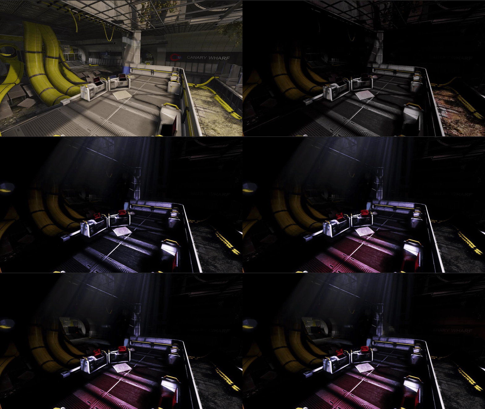
  • Thiago Jaqueta

(BlackboltLW) #2

I think you should tone down the lens flare, it’s a bit too bright imo

But this is awesome! Honestly I want to see Underground in night, imagine the ‘creepy’ feeling


(ThiagoJaqueta) #3

Yea, I agree, funny part is that the “lens flare” were the result of increasing the exposure of the image xD.

Is this any better?

Underground would be cool, specially the last objective, I could put the moon in the hole, add some god rays… Make the signs shiny and bright, lot of contrast… yea.


(Herr_Hanz) #4

its looks epic! maybe we should have night and day version of maps in rotation :smiley:

my favorite game Battlefield Heroes had that. it was epic. they also had winter versions :smiley:


(Dagasawr) #5

I think it looks great :slight_smile: but if I was going to be picky I would say you need to look at the light in the bottom right corner because it doesn’t look like its emitting any source of light and the exposure on it makes it look kind of burnt.
I whipped this togeather in 5 mins on my lunch at work:

just so you get what I mean :slight_smile:
EDIT: spent a couple more mins on my example (while the boss was in a meeting >:) )


(RazielWarmonic) #6

Holy crap what an awesome idea! I wonder if people will make night time versions of other maps? :open_mouth:


(CadGamings) #7

With “people” you of course mean SD devs… :wink:


(Blubehriluv) #8

That’s partially why I love Chapel so much. Night maps are amazing!!


(frostyvampire) #9

Underground because it’s well… in the underground so it will be easy


(Blubehriluv) #10

This veers a bit from just the “day or night” sort of thing but imagine a storm at night above Underground while rain falls through some of the cracks or occasionally lightning strikes and light flashes through the glass in the ceiling. Would be epic and maybe a bit much but it’s a thought. Sneaking around as phantom or rushing around as a medic would make things super intense with all that dramatic lighting.


(Xenithos) #11

This veers a bit from just the “day or night” sort of thing but imagine a storm at night above Underground while rain falls through some of the cracks or occasionally lightning strikes and light flashes through the glass in the ceiling. Would be epic and maybe a bit much but it’s a thought. Sneaking around as phantom or rushing around as a medic would make things super intense with all that dramatic lighting.[/quote]

I could imagine this in a halloween update some year. :open_mouth:


(ThiagoJaqueta) #12

Ohhh I see, that was my Fail atempt to completely remove the light. At first, it was almost like Battlefield 3 Lens Flare, since I couldn’t remove it, I decided to tone it down a little bit. And make it look like it’s on, but with less exposure to avoid over brightness.

Thanks for the feedback everyone, I appreciate.

I’m working on Underground now, I made it really dark, but I’m preserving the Light Sources, giving a lot of contrast, is looking good!

However, I’m having some issues to work with dark colours, like the colour depth is not enough (It only affect dark tones), maybe it’s my monitor gamma or brightness, I tried to use 16-bit and 32-bit colour mode, but it didn’t helped much. Maybe the problem is actually in the Screenshot, I used Steam screen capture feature, when I realized, the quality was kinda poop.

Anyway, thanks everybody, Underground Night Version coming SOON™


(Brycko) #13

@Ye_Olde_Buttcheeks also made some from the Weather Varients thread started in Map Discussions a while ago.

Sunset Chapel

Rainy Underground at Night


(doxjq) #14

I thought Chapel was day time lol. I use potato settings, everything on minimum, texturepoolsize 1, fogdensity 0 etc, and the sky is just grey to me. Just looks like an overcast day.


(Your worst knifemare.) #15

Give me sunset chapel. It looks great.


(YeOldeButtcheek) #16

I was called
Night

Dusk

Night


(ThiagoJaqueta) #17

Underground is Done, Check the Main post!

Any feedback is appreciated! Thanks!


(Blubehriluv) #18

This veers a bit from just the “day or night” sort of thing but imagine a storm at night above Underground while rain falls through some of the cracks or occasionally lightning strikes and light flashes through the glass in the ceiling. Would be epic and maybe a bit much but it’s a thought. Sneaking around as phantom or rushing around as a medic would make things super intense with all that dramatic lighting.[/quote]

I could imagine this in a halloween update some year. :open_mouth: [/quote]

Exactly what I thought about!

Also @Brycko @Ye_Olde_Buttcheeks That rain underground is awesome


(CadGamings) #19

@ThiagoJaqueta Those are some serious PS skills! LOVE the maps, I think this would be so cool if SD would actually make this a thing. It would be a great substitution till they actually design new maps, wich I can imagine would time much more time than redoing old maps.


(Xenithos) #20

[quote=“ThiagoJaqueta;212002”]Underground is Done, Check the Main post!

Any feedback is appreciated! Thanks![/quote]

Only because you want feedback: you could have brightened the monitor that gave the red overcast on the floor of the command console area. Otherwise the brightness on the floor makes the ground look crazy shiny, or there’s another light somewhere… Gah, this is why I don’t give feeback. Ground is too red, k. Done.

Other than that it looks great. If SD were to ever implement these custom DB maps, they’d add a few more lights, dim ones hopefully, so that it would be easier to play on. But other than that it’s gorgeous Thiago!