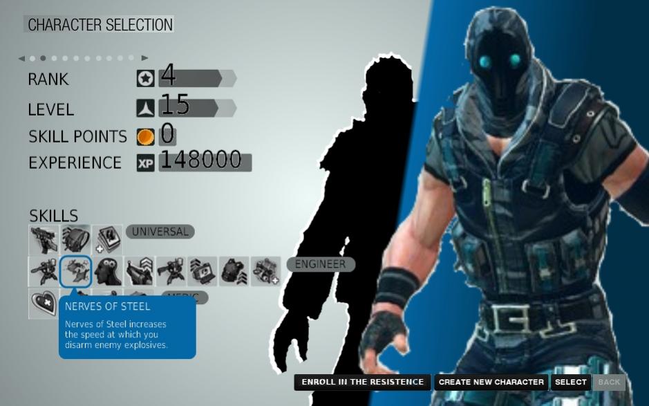
Select Character Screen mock up


(Mothluin) #1

Hi!
This is my first post in the forum, but I’ve been following Brink way before its release.
I was interested in the game as, in my eyes, it was a weird colorful tropical fish in a sea full of grey goldfishes.
I bought the 360 version of the game as my desktop PC is more than 7 years old and don’t need to replace it at the moment.
I, as many, was a bit turned off by how brink was ported to consoles and hoped in a further polishment via DLC.
I mean, the game is really good and FUN when: * you can close an eye on graphical issues, * there’s little lag (although I must say I almost never had serious issues in this field), * you have humans to play with.

Anyway, I digress.
This morning I had nothing to do, so I made a mock up in Paint (yes, I’m no pro designer or whatsoever :stuck_out_tongue: ) of the character selection screen.
I guess not many people could be interested in this, but I believe each contribution to the devs could be worth so… here’s mine.


I just edited a screenshot I found on the internet, scaling parts of the original image and such.
As previously said, I’m no designer, just throwing my two cents…

(Crytiqal) #2

So what you suggest they do with your picture?

Remake the entire selection screen?


(Cep) #3

[QUOTE=Mothluin;372364]
I, as many, was a bit turned off by how brink was ported to consoles [/QUOTE]
Woah woah woah, now wait there just one minute me young whipper snapper. Ported to console?

Lets just correct that statement right now, ported to PC more like.

As for the pick, its nice and refreshing to see a different take on the screen. Maybe you should apply for the GUI position at SD ;D


(H0RSE) #4

I think instead of listing your character’s ability icons all grouped up, they should be separated (and labeled) by category.


(Jimmy James) #5

[QUOTE=Cep;372567]

Woah woah woah, now wait there just one minute me young whipper snapper. Ported to console?

Lets just correct that statement right now, ported to PC more like.[/QUOTE]
I had the same reaction when I read that statement.

-JJ


(VG_JUNKY) #6

I think instead of listing your character’s ability icons all grouped up, they should be separated (and labeled) by category.

they r in his picture…
i myself lk the design… if more dlc hits or another game of somekind, this would be a great idea :stuck_out_tongue:


(Mothluin) #7

[QUOTE=Crytiqal;372370]So what you suggest they do with your picture? Remake the entire selection screen?[/QUOTE] I think the current selection screen does a bad use of screen space, hence I proposed my own reinterpetation. As I said, I’m no designer, I just had this idea in my head for al ong time and yesterday I had enough time to sketch something close to what I had in mind. I uploaded my reworked screen because I felt I needed to, as well as to contribute to a game I really like, just as other people may suggest guns to be nerfed or tweaks to be applied.

My fault for using the term “ported” :slight_smile:


(H0RSE) #8

I know that’s why I brought it up - I was agreeing with his idea…

I do have eyes. I can see…


(TruGamer97) #9

Not sure if I like this one much but I did like this one quite a bit


(wolfnemesis75) #10

[QUOTE=TruGamer97;372978]Not sure if I like this one much but I did like this one quite a bit
[/QUOTE]I remember that one from early dev videos. It has a cool look. Did that load slower or something? Its interesting to see all these early builds. :slight_smile: