remove. all. of. the clutter.


(shaftz0r) #1

i cant believe that this still hasnt been addressed. the amount of crap i can see through the walls drives me insane.

the reason that its a tipping point for me now is because of canary wharf. there are 2 phases where the enemy is standing right where the massive, annoying obj markers are. Im literally completely over even seeing them at all. its more than just an eyesore, these are game breaking blind spots. Regardless of the fact that i dont want to see them to begin with, and that its pretty ridiculous for everyone in the server to know that someones defusing, you dont need them after playing a map a few times. for side obj, possibly, but just put a build box like in et, or be more creative than a massive obj wheel. why can i see deployable stations through the walls of the entire map? do i really need a massive ammo thing over teammates heads?

i understand that you’re dumbing this game down as much as you possibly can, but this is getting ridiculous


(BomBaKlaK) #2

another Brink vestige


(Hundopercent) #3

[QUOTE=shaftz0r;489387]i cant believe that this still hasnt been addressed. the amount of crap i can see through the walls drives me insane.

the reason that its a tipping point for me now is because of canary wharf. there are 2 phases where the enemy is standing right where the massive, annoying obj markers are. Im literally completely over even seeing them at all. its more than just an eyesore, these are game breaking blind spots. Regardless of the fact that i dont want to see them to begin with, and that its pretty ridiculous for everyone in the server to know that someones defusing, you dont need them after playing a map a few times. for side obj, possibly, but just put a build box like in et, or be more creative than a massive obj wheel. why can i see deployable stations through the walls of the entire map? do i really need a massive ammo thing over teammates heads?

i understand that you’re dumbing this game down as much as you possibly can, but this is getting ridiculous[/QUOTE]

Wait until they finish developing the yellow tracer that pulses on the ground guiding you to the nearest obj.


(DarkangelUK) #4

I imagine eventually we’ll have the choice to disable a lot of the HUD elements in the future


(Smooth) #5

This.

Also screenshots would be useful :slight_smile:


(shaftz0r) #6

[QUOTE=Smooth;489403]This.

Also screenshots would be useful :)[/QUOTE]

ill take some screenies if thats really necessary, but honestly, anywhere that you might fight, and there are massive obj markers there, is a problem. last phase of waterloo is a prime example, but CW really just topped it off for me. Theres just too much visual nonsense all over, specifically that last phase. moving water, sparks, huge obj wheels everywhere. its too much.


(Kendle) #7

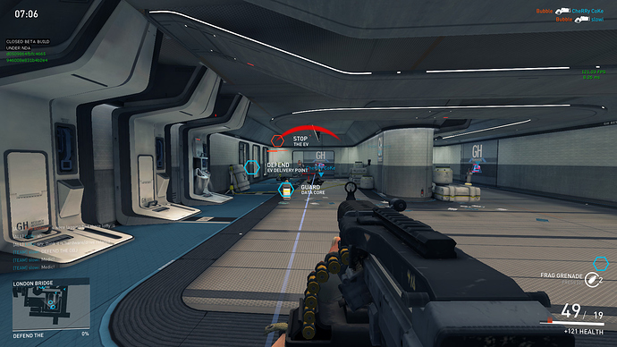
+1 for this, I find the HUD hugely off-putting in many places. The data-core room in LB for example, it’s hard to know what to shoot at with all the junk on screen. I really would like to get rid of the objective markers for a start.


(Mustang) #8

Screenshots are good for getting the default setup nice for most players.

Customisability/configs/hud editor is good for those of us that like it very very clean or to tweak specific things to our liking.


(Anti) #9

We are in the process of continuing to tweak this stuff, so any feedback on specific elements that are too intrusive, or that you feel are missing, would be very helpful.


(shaftz0r) #10

the actual hud itself is ok right now imo. as of 2 patches ago, i havent even had to use the cfg editor. There’s just too much going on through the walls. even something as simple as an opacity slider would help this problem exponentially.

i feel like part of my personal issue is the dumbed down effect these things have. maybe on the first few times playing a map to get the flow down, but after that they’re extremely intrusive. couple that with being able to see when a defuse/cap is happening, and its almost game breaking. I appreciate that you removed the enemy teams mercs on the top of the screen, but i feel that this is similar in effect


(BomBaKlaK) #11

Most of all, BIG objective icon !! really to big, and to intrusive.


(Kendle) #12

LB defending data cores …


I’m shooting at 2 bad guys there somewhere, if you can make them out behind all the text and icons.


(Pytox) #13

yea it should be a little bit bigger when you are closer but small when far way from it :slight_smile:


(Kendle) #14

Just add selectable opacity values for anything that appears on the HUD (apart from the gun model), so you can reduce their impact or remove them entirely.


(.Chris.) #15

Exactly, in ET:QW you could change the opacity of pretty much everything on the HUD from within the menu using sliders, didn’t need to piss around with configs.


(BomBaKlaK) #16

just an option to remove the text (Do this and this) and reduce the icon size and alpha.


(ailmanki) #17

those infos have nothing lost in the vista.

Move them out of the main sight, either in to minimap, or top/bottom of screen - to give an indication of direction. Transparency and size are no solution, the solution is to completely move em somewhere else.

The name of your friendly player is the only thing which can be left in with transparency. But in case of a player waiting for medic, it should be written over him, and not above with an arrow.


(Dormamu) #18

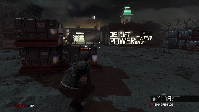
The obj text “Stop the EV”, “Defend …”, “Guard Data Core” can be written on the floor/walls/doors, something like in the Splinter Cell Conviction:


(Mustang) #19

To be honest I assumed they forgot to turn them off after recording the intro video’s, these text’s have no place or need.


(tokamak) #20

[QUOTE=Kendle;489569]LB defending data cores …


I’m shooting at 2 bad guys there somewhere, if you can make them out behind all the text and icons.[/QUOTE]

Yeah spot on.

I see that stuff mainly as some really bad left-overs from developing for consoles.