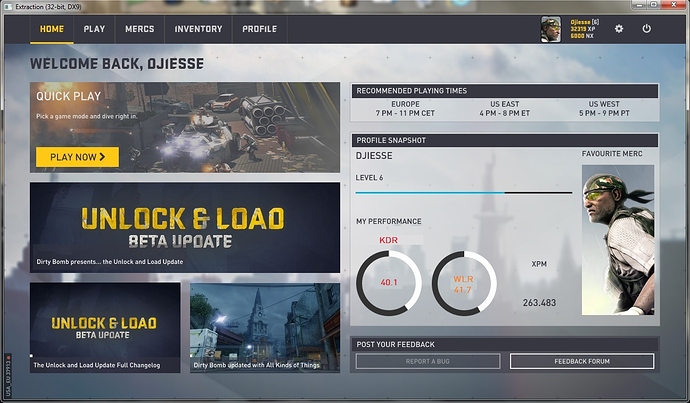
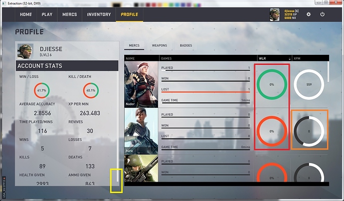
Here’s my long list of issues with the current presentation of the profile info. Many of theses issues were raised after the June update (http://forums.warchest.com/showthread.php/40875-New-Front-End-UI-Feedback?p=503632&viewfull=1#post503632), but since they remain to be addressed they will be repeated here for completeness…
Issues seen on more than one page:
[ul]
[li]KDR is currently calculated as kills / (kills + deaths) instead of kills / deaths as the name implies. But besides the misleading terminology, the current value makes no sense as a stat since (kills + deaths) doesn’t translate into any significant metric.
[/li]
[li]True KDR cannot be represented using a circle since it’s a number between 0 and infinity with no reference value to scale it. The circle representation only makes sense for values that can be scaled from 0 to 100%.
[/li]
[li]What is shown as WLR is actually calculated as % Win (wins / games_played while WLR would be wins / losses). What we have now is actually a more intuitive stat, but its name needs to reflect that: “% Win” or “Win Ratio” (but not “Win / Loss Ratio”).
[/li]
[li]Somehow the overall XPM does not match the total XP and time played (about 5-6% lower than it should be at every step of my progress where I did the calculation), Also it should not have decimals: integer is good enough especially when dividing int XP by int mins and it’s shown like that in the merc stats.
[/li][/ul]
Profile Summary on Home page:
[ul]
[li]Presenting something as “xxx wlr” makes it look like “wlr” is a unit, not the name of the stat. It should be all caps since it’s an acronym and placed either above the circle (red example below) or inside the circle but above the actual value (orange example).
[/li][/ul]
Profile page - Account Stats:
[ul]
[li]Old outstanding issue with accuracy clearly not being hits / shots fired. It used to be backwards (shots fired / hits) and I suspect it is still the same. It appears to be calculated correctly in the weapons stats…
[/li]
[li]There is no reason to write “[LVL]” instead of “Level”
[/li]
[li]Imbedded scroll bars should never be used in a UI when they can be avoided and it’s pretty obvious that it could have been avoided here with the slightest change in font sizes or vertical spacing (see next picture below). This is resolution-specific, but should still be fixed so it doesn’t happen on any of the supported resolutions.
[/li][/ul]
Some points recycled verbatim from my previous feedback:
[ul]
[li]Having “Kill / Death” given top-billing with “Win / Loss” is sending the wrong message about the game. XP if balanced properly should be a better measure of your contribution as it rolls up together kills, team support and objective focus.
[/li]
[li]Grouping of the stats is still disorganized. Notwithstanding what I said above about KDR, the raw stats related to the top graphics should start the list. So as it is now, we should have “Wins” and “Losses” on the first row, followed by “Kills” and “Deaths”. I would also like to see “Health Given” and “Revives” side-by-side, with “Ammo Given” on the row above or below (i.e. medic stats together, team support stats together).
[/li]
[li]“Time Played / Mins” reads as “time played divided by minutes”. Make it “Time Played (Mins)” or simply “Time Played” and put the “mins” after the number.
[/li][/ul]
Profile page - Mercs tab:
[ul]
[li]Sort key indications are not consistent. When sorting mercs by name, the up arrow corresponds to ascending alphabetical order (A-Z) and the down arrow to descending order (Z-A). This is the same as on the server browser: up arrow = ascending (smallest value to largest), down arrow = descending (largest value to smallest). However, when sorting mercs by stats, the arrows have the opposite behavior: up = descending (highest value first) and down = ascending (lowest value first).
[/li]
[li]Mercs which have been played but never won can show a WLR in green. This one should definitely be red (100% loss). I guess the WLR for unplayed mercs could remain red / 0 as it is, but it would be more readable if it was grey to indicate no results recorded.
[/li]
[li]Several of the mercs I haven’t played yet are showing a KPM of 0, but the circle is partially filled (see picture above).
[/li][/ul]
Again, some outstanding issues from previous feedback:
[ul]
[li]How is the “Played” line scaled? Looking at my stats, I would say it’s (number of games played by the merc) / (total number of games played by all mercs). But since all participating mercs seem to get a game result, that total can be as much as 3 times the number of games you played, so that ratio seems a bit meaningless. I would suggest to use one of these two alternate calculations instead:
[/li]
(number of games played by the merc) / (total number of games played) (overall account stat)
or
(number of game played by the merc) / (largest total number of games played by any mercs)
The first would show the percentage of your total games a given merc was used in (absolute %), the second would rate the merc’s usage against the most used one (relative %).
[li]As they are currently, the “Won” and “Lost” lines are redundant with the “WLR” circle as they show the exact same info. I would suggest the same alternate calculations as for the “Played” line above, so the info becomes either the percentage of overall wins (losses) the merc played in, or how does the merc compares to the merc with the most wins (losses).
[/li]
[li]“Game time” is OK as it is, but if you ever decide to change the “Played”, “Won” and “Lost” lines to be comparisons vs the top merc, then this one should be changed accordingly as well.
[/li][/ul]
Profile - Weapons:
[ul]
[li]Sort indications are inverted for all sort keys, including Name (up arrow = descending, down arrow = ascending, should be the other way around).
[/li]
[li]Still no stat lines for ability weapons (Nader & Rhino). At least melee weapons are in now…
[/li][/ul]
And still outstanding:
[ul]
[li]Sorting by stat should always sort weapons from best to worst first, with a second click giving you the opposite order. Right now it’s the other way around and I don’t think anyone cares to see weapons that were never used at the top.
[/li]
[li]Sorting using “TU”, “K” or “A” gives incorrect orders as some weapon lines are listed out of sequence.
[/li]
[li]The “TU”, “K” and “A” circles are scaled against the player’s overall stats, which is technically valid, but if you play with a variety of mercs this results in a lot of short arcs that are difficult to visually compare to each other. As mentioned for the merc stats, comparing against the best weapon would result in circles ranging from empty to full (best weapon for that stat), as opposed to empty to maybe 1/4 or 1/3, giving more easily visualized variations between weapons.
[/li]
[li]I can’t figure out how the “K/M” and “A/M” circles are scaled. Clearly it’s not against the best weapon (at least one would have to have a full circle), and it can’t be against the player’s overall performance either because that’s an average and some weapons would be above that (e.g. if your overall K/M is 3.0, you for sure have weapons with a K/M > 3.0 but you can’t fill more than 100% of that circle…). Honestly I can’t think of any scaling that makes sense for these 2 beside vs the best weapon…
[/li][/ul]


