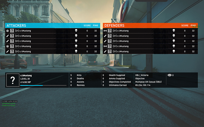
Notice how it is so much easier to identify the classes of the defenders than those of the attackers:
Make field ops icon distinguishable from soldier icon
I vote the explosion icon (used in the obituary when killed by arty) for the field ops. I’ve got used to the current icons but I have to think about it for a sec which I shouldn’t have to. Never noticed that att & def have different icons - they should be the same for both teams IMHO.
They don’t have different icons currently, this is just my Photoshop skills coming into play to demonstrate that the radio beacon is much nicer, clearer, less confusing and easier to “read” in the heat of battle.
I said this since the alpha started. Beginners will have problems with the icons we got at the moment. SD please make field ops icon more distinguishable from soldier icon!
The fieldops has another icon first but that was also confusing, I made a thread about it a while ago.
Maybe change the soldier icon to a grenade and the current soldier icon (1 bullet) to the fieldops 
But then the soldier icon need to be changed aswell or we get the same problem as before that new players will think that the soldier has ammo instead of the fieldops.
What about a helmet for the soldier and bullet/s (or explosion) for the fops? (ET much, as I checked now  )
)
Well i personally dislike the helmet icon, but either bullet or radio(/explosion) is fine for fops.
That leaves helmet (eww :(), bullet or something else for soldier.
Either way, lets not have bullets for them both!
Yes, the icon needs to be changed. Never can remember which one is which. I suggest a grenade icon for soldier.
Field ops icon should be what it’s now so new players understand he’s got ammo. A beginner probably doesn’t need to know if he’s got arty or not.
Soldier could be something like a heavy weapon icon, grenade, helmet, c4 etc.

