Layout of Loadout Preview


(DB Genome editor) #1

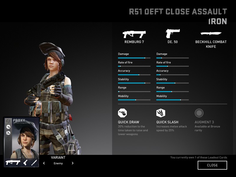
When using a 4:3 aspect ratio or one of the other “square” ones, the loadout card shown on the preview page is in the bottom left corner:


It overlaps a bit with the model, but not too much.

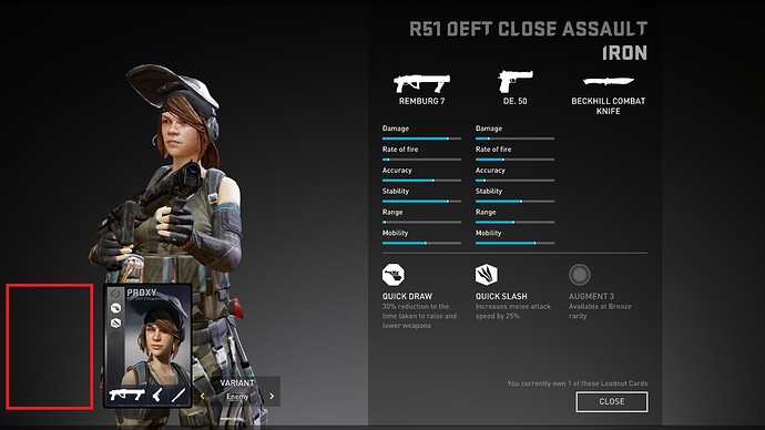
However, when using a wide-screen aspect ratio like 16:9, the card ends up almost centered on the model, hiding a fair chunk of it (especially on the smaller female mercs):


Any technical reason it can’t be pushed in the corner as shown by the red outline? Honestly, the card could actually disappear completely to leave all this space for the model preview since all the info on it is already elsewhere on the preview page except for the merc’s name, so it’s totally redundant.

(AssortedStuff) #2

They position the important elements within a “safe zone”, which is the 4:3 ratio. Similar to what is done in TV/Broadcasting. This way it is guaranteed that everyone will see them.


(Mustang) #3

Not how it work’s I’m afraid, you know the target resolution, there is no need for a safezone concept, it’s either an aesthetic choice or not full implemented multi-aspectratio support.

Although I find the 16:9 version more attractive and find it’s the 4:3 that looks odd not being centred.


(DB Genome editor) #4

The 16:9 version doesn’t look centered to me either, it just feels like a random position which happens to mask half the lower body of the models…


(-PogS-) #5

+1 with Djiesse. I don’t like the 16:9 because it masks the model and it is a bad thing for my skin collection document. But thanks to you, Djiesse, I know the 4:3 is better for my purpose :slight_smile: