Sometimes you post statistics about Dirty Bomb, like you did in the Summer Squash Part 2 video today.
I would love to see more dirty stats, can you give them to us? 
@RazielWarmonic @stayfreshshoe @Exedore
Hey, devs, can we see some of those cool graphs?
BerylRdm
(BerylRdm)
#1
RazielWarmonic
(RazielWarmonic)
#3
Last time we posted graphs, well to say the least, it didn’t go down too well.
What kind of graphs would you specifically like to see?
MisterBadmin
(MisterBadmin)
#4
[quote=“RazielWarmonic;203332”]Last time we posted graphs, well to say the least, it didn’t go down too well.
What kind of graphs would you specifically like to see?[/quote]
I was actually going to write a thing and send it to shoe. sometime this weekend.
Short version: Actual Data
The infamous graphs in February’s Fine Tuning were all “Relative.” Relative data isn’t as useful in explanations.
Take the Assault Rifle Effectiveness graph:
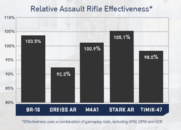
This tells me that the Stark and BR were better than the others, but not WHY. Given graphs of KPM(avg), ,KPM(across mercs with weapon), Kills per Mag, a distribution of kill ranges, and % of kills from Full Health, I could write a 40 page paper with mathematical analysis of why the Stark was broken.

BananaSlug
(BananaSlug)
#7
i would love to see them too, if you dont feel like posting it here is good idea thats fine, i know why
The_N00Ba
(The_N00Ba)
#9
Yeah I remember those graphs. MisterBadmin described one of the main ways that post could have gone better.
I will also add that I feel the post did not explain the data enough due to it’s length.
From my experience with Statistics in college those graphs could have worked had they been accompanied with a very detailed written explanation but we are talking a 40 page explanation much like what MisterBadmin said.
I don’t know if that is really what you guys want to do though Raz.
I personally do not recommend putting up graphs like that again unless a very detailed explanation goes with it or you are looking for our reaction and feedback.
If you are going to use graphs keep them simple with 1 or 2 things at most kind of like what Beryl wanted.
I recommend this because not every one likes math or are freaks of nature like MisterBadmin and myself. I think keeping it simple could help reduce confusion and miscommunication in the future.
Also providing some of the raw data will help out a lot like MisterBadmin said but I would not provide everything. Just a brief summary of what was used for the graph.
I say this because for one thing. Given a set of data 10 different people can come up with 10 different conclusions from the same data. For another, some of us will use it against you, which if you are looking for feedback does help in some fashion.
I still have to advise caution with just handing out data though. We seem to be a very expressive bunch.
I do offer my services if you guys ever want a second opinion on the quality of a graph post. I want to avoid those instances of unpleasantness as much as you do.
Dawnlazy
(Dawnlazy)
#10
Honestly it’s not the graphs, it’s using them to make rather weird balancing choices. For instance Rhino is a very rare sight in game, I sometimes pub for hours on end and don’t see a single Rhino, the general consensus is that he sucks 97% of the time, yet he got nerfed in one of those graph patches…
MisterBadmin
(MisterBadmin)
#11
(For the record, I intentionally went overboard with the amount of graphs in that last post. The big point of that was explaining why changes are made numerically with RELEVANT data rather than RELATIVE.)
Let me craft you a few example graphs with my EPIC PAINT SKILLZ to illustrate the recent PDP and PDP Wielder changes:
I shouldn’t have to include this, but I obviously have no access to SD’s database of delicious numbery goodness. All numbers are purely memes.

Juan518
(Juan518)
#15
I have just changed the graphic options from custom low to max, same fps, 60 (yes, i restarted the game)