Dead_Cold by JMW BETA 1 Released on 11/23/04


(JMW) #1

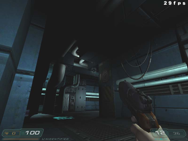
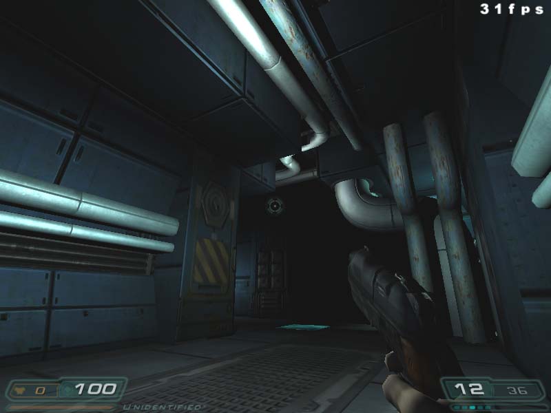
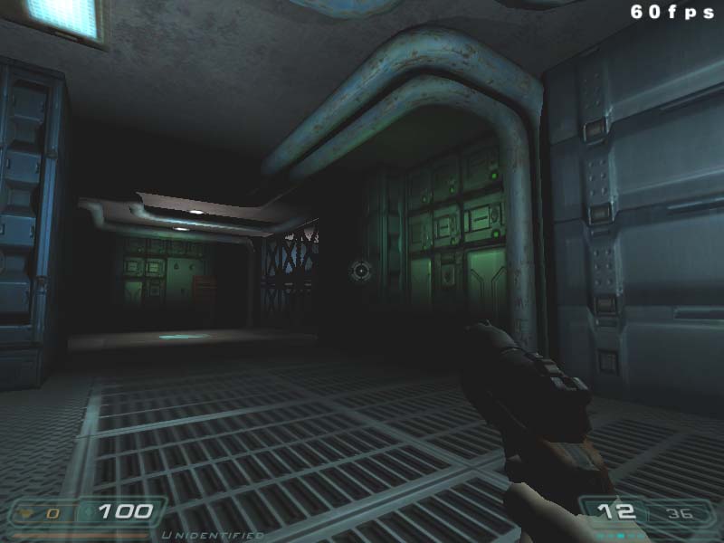
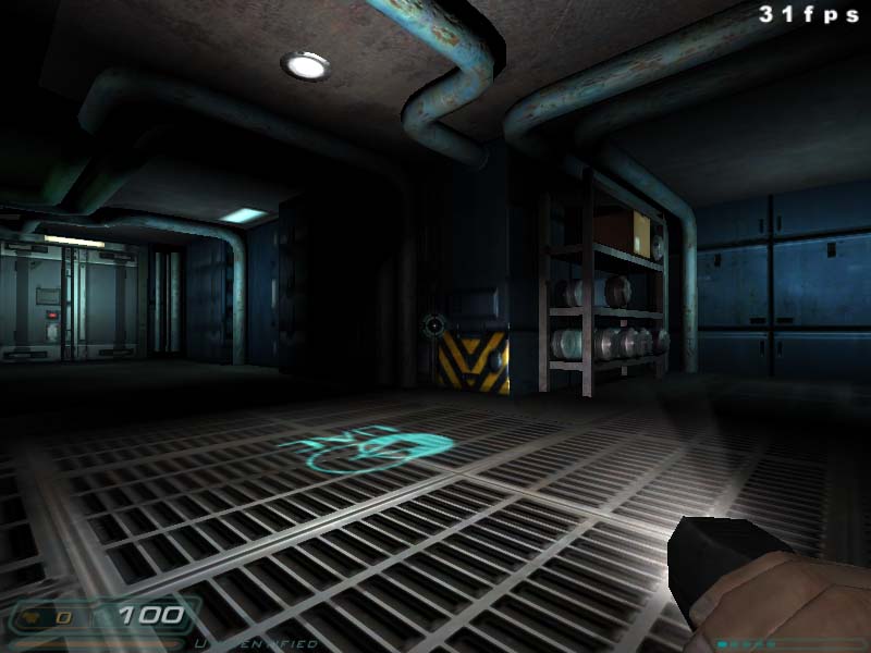
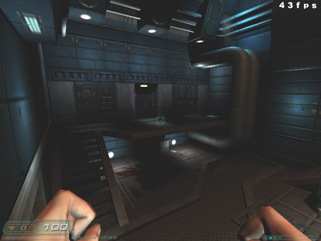
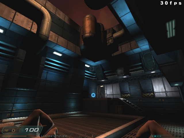
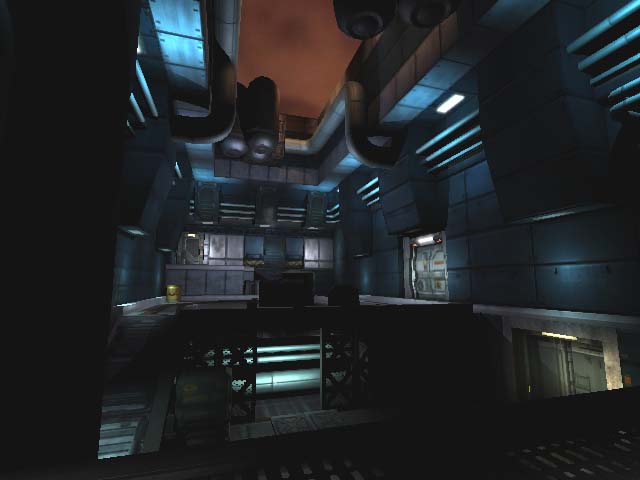
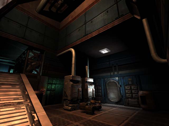
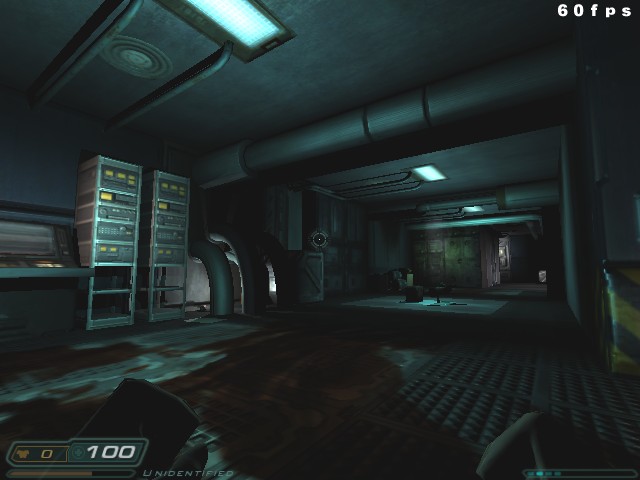
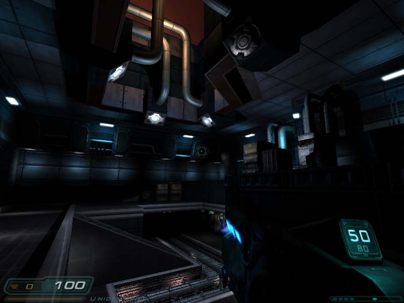
Been working on and off on this map for a few months now. I have finally got it to a playable beta stage. Anyway, comments on the map are appreciated as nothing is set in stone yet. So, feel free to bang away.

Thanks —> JMW

www.jmwrightdesigns.com

info: www.jmwrightdesigns.com/design/games/D3.html

download: www.jmwrightdesigns.com/maps/dead_cold_beta1.zip


(Zombie13) #2

I dunno, I like the look of the lighting myself, looking quite cool there. :slight_smile:

Zombie


(Wils) #3

It’s sometimes nice to have the lighting modulate from a variety of base levels - in those two shots, nearly all your lighting is going from black to lit to black again. Washing the area with a dim light before picking out the highlights might be good.

On the subject of lighting, it was cool to see the shootable lights being used in the tournament games at Quakecon. I don’t know if you plan to add features like that to your map (this applies generally to anyone making a map for Doom 3), but it would be nice. I’m seeing a lot of Doom 3 maps which play like Quake 3 maps, and I think this is a mistake - Doom 3’s a little different, with more of a focus on dynamic lighting features and cautious, tense combat, then garishly lit arenas with players zooming about on pickup routes.


(K^2) #4

That way after a long match you will not have any lights left at all. I personaly think it works better with the switches. And the dynamic shadows only help to allert you of someone’s presence, which is usualy not a factor unless you are trying to camp.


(swelt) #5

I thought the way Fatal1ty hid in shadows at the end of the grand final was a sure sign of things to come. The whole shadow play thing works amongst friends and for fun, but in an ultra competitive environment I think (and I know I am speculating here given the youth of the game) it will become seriously detrimental to fun factor, significantly reduce spectator enjoyment and cast ‘shadows’ over competitions.

I’m concious of hijacking this WIP thread with a broader (and I think quite important) discussion. Shall we move this to another thread?

JMW: screens look promising. Good balance of function and detail. I look forward to seeing more.


(ordo) #6

Very nice JMW


(wviperw) #7

Looks quite original there JMW. Nice job so far.

I’m concious of hijacking this WIP thread with a broader (and I think quite important) discussion. Shall we move this to another thread?

I’m going to start a thread over at D3W about this very topic.


(K^2) #8

I do not think we should spread this discussion between two different forums. So it would be best if you could either post the link to the thread in this forum there or give us a link to your thread D3W forum, so we can all discuss this together in one place.


(JMW) #9

been away from this map for awhile due to some final HL1 projects I had to finish up…but Ive finally been able to get back at it. Here are a few screenshots, nothing too fancy, just hallways. But the map is alive and kicking again!

-JMW
www.jmwrightdesigns.com


(Zombie13) #10

looking funky, but I must point out, cause you might not have noticed but, there are quite a few texture missalignments in those shots, for exmaple dc5 has the floor ending oddly on the left hand side, you could add a nice trim to that to make it look hot, also might want to try and add some nice endcap decals to your pipes there, gives a nice complete look thats always good in my books.

Keep it up though.
Hope that can help in some deranged way or something… :smiley:

Z


(JMW) #11

Thanks for the feedback…
Yea there a bunch of pipes that need a connector cap so they dont look like they just dissapear into the wall.

I see what you are saying about adding some trim around the floor, I will check that out. Im pretty sure I skimped on some of that in other areas as well.

You mentioned more misaligned textures…from the pics what else did you see that really stood out?
+
I will be glad to get this map to a beta phase. It will be easier for people to point out issues that I dont really see. After staring at the same map for too long, I stop seeing those little errors.

-JMW
www.jmwrightdesigns.com


(JMW) #12

creeping along on this one. a couple other shots of the second atrium WIP. Should make it to beta 1 soon.

-JMW


(michi.be) #13

There is a “edit” function in this board. ;-p

Regarding the map a little more variation in colors and textures would be fine. i like the last three shots most.