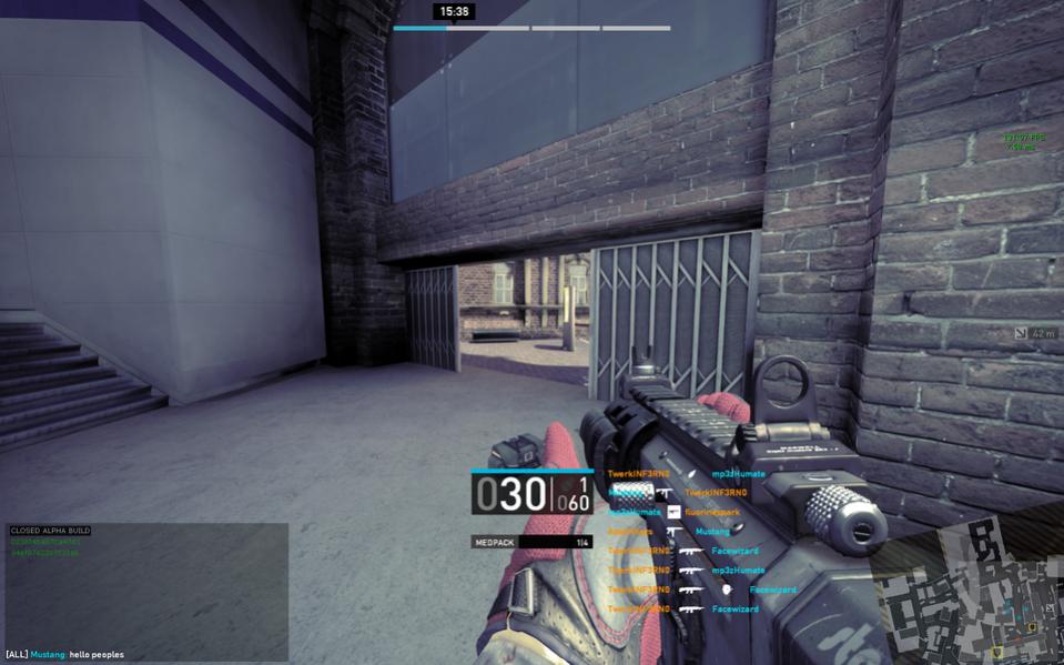
Right now my experience with some of the UI settings are beginning to wear on me a little bit.
I noticed the more games I’m able to play with full servers, the more cluttered things feel. Especially on White Chapel during the Ammo objective. Having a full team of 8 with their names / classes combined with the ~6 Ammo containers all showing up through walls etc, it fills up your screen and makes it difficult to see enemy players.
I can appreciate the idea that sometimes too many options are overwhelming, but I think it can go a long way.
Some option ideas I have (in no particular order):
Toggles:
- Player Health (on/off)
- Player Health % (Only display if someone is < 50% or whatever it’s set to) - Player Name
- Player Class (on/off)
- Toggle Specific Classes (e.g. I only want to see Medics and Engineers) - Objective Type
- Line of Sight (on/off)
Misc:
- Scalable Elements (e.g. Overlay size based on distance)
- Customizable Colors (e.g. Enemy Engineers / Medics as Red, all other enemy colors as Orange, Team Medics as Green etc)\
I know I had a few more ideas, but I’m currently brain-locked. I know these would definitely help in prioritizing targets (enemy or team), as well as opening up the field of view without cluttering up my screen with information I may not want or need. I think it’s important to give players the option to make their information gathering as efficient as possible.
Any other thoughts?


