Hey guys,
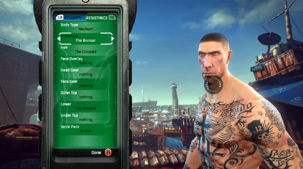
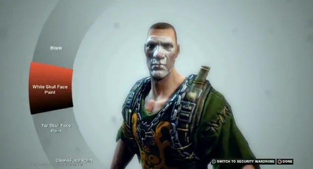
I’ve seen 3 different menus for customizing your character and I was wondering which one everyone liked best. I personally like the 2nd because the selection menu is rounded, which I have not seen before.
1
2
3
![]()
Character Customization Menu
evnted
(evnted)
#1
Shadedluck
(Shadedluck)
#4
I like 3 and 2, 3 because it’s simplified, and 2 for the same reason you put.
evnted
(evnted)
#5
Yeah, my other choice would have been 3. 1 is…too much, in a sense. I lose focus on my character and more on the background.
boozee84
(boozee84)
#12
i like the 1st. seems to be pretty funtional and the background is a nice bonus.
SentencedToBurn
(SentencedToBurn)
#13
I like 2 the best, 3 looks more clean-cut and organized but I for some reason really like the stylized look of #2. and It looks functional at the same time.
indirect
(indirect)
#14
3rd is the one that is the real one so… + it’s easily got the best functionality.
Schwarzeis
(Schwarzeis)
#15
I prefer the second one, looks better, but probably doesn’t work as good as the third one