Looks very nice 
BT-5 Texture & Model Criticism
Pegazus
(Pegazus)
#42
Thanks Thunderpwn, that texture you showed comes very handy.
@Sage
^^ Danke. Just found a good image for the wheel textures.
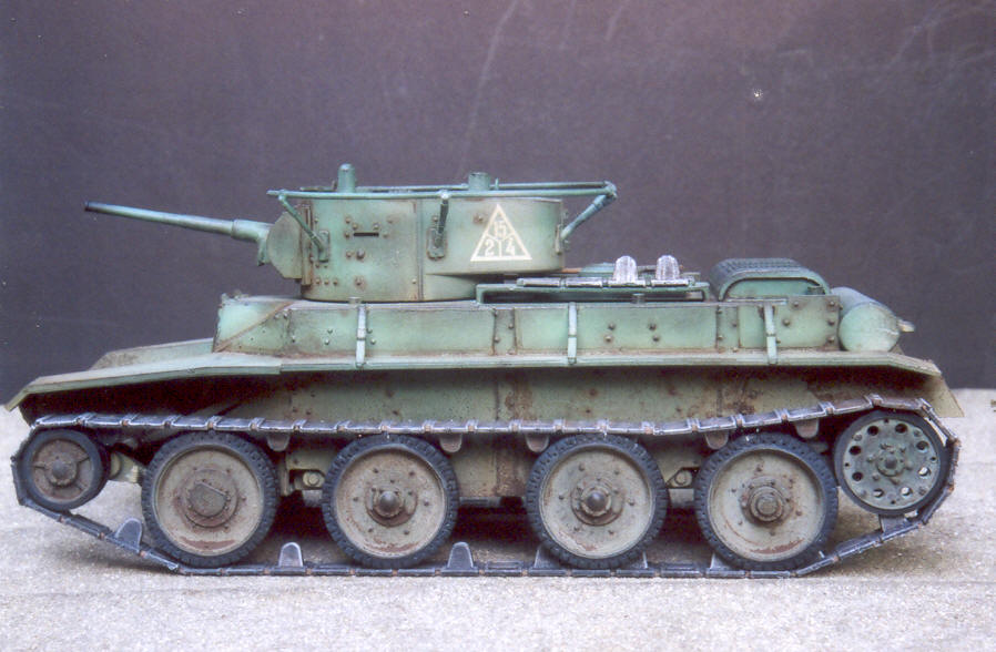
image a bit blurry, but nothing a little unsharp filter can do.
Oops, how i forgot that lol.
@Magic
thanks for the supprt
Pegazus
(Pegazus)
#44
[QUOTE=shagileo;188863]Now that’s what I call a tank !
Great job[/QUOTE]
Thanks Shag !
The tank is finished now (Except animations, don’t have skills in that) and there are now custom wheels texture.


These images are also in the 3D Album.
Some information about this tank if someone is curios.
Tank name - BT-5 (In russian BT is for short Fast Tank)
Type - Light cavalry tank
Place of origin - Soviet Union
In service - 1932 -1945
Speed - 72 km/h
AlphaRed12
(AlphaRed12)
#47
Ok, no offense of course but…the texture is kinda weak. I will outline soem things wthat could be done to improve the texture by millions.
#1. You need to use contrast!!! The whole hting looks too uniform which tanks are not. There must be contrast between pieces. This will make the texture stick right out by being able to distinguish each pice easily.
#2. You need to make each piece from a seperate piece of the texture, not the same exact texture repeated. You need to make each piece individually because (as I said before) it makes it look too uniform. Not every piece grunges the exact same way. You need to differentiate (sounds like Calculus again :D) each piece by either blending it differently or something else. (all depends on how you work in 2D)
#3. Use the burn and dodge tool. These two tools (opposites of each other) are amazing when used properly. They allow you to shade and control contours on the texture (whether to compensate for the geometry or to assist the geometry). If you need exampels of how to use this I will psot up a few examples and show you how to use it effectively.
#4. Use grunge and scratch brushes!!! These allow you to make grunge and scratches in random places and look great on War paraphenalia. (This goes hand in hand with #3.)
These are only a few helpful tips that I can give you. To help you more I’d need to see the flats and then go from there. Hope this helps you.
aaa3
(aaa3)
#48
iirc its on wheels, on track it should be less, and offroad even lesser. these tanks originating in the christie design, an american inventor woh made these plans at lat 1920s but no customer were interested so he sold em to the soviet union. it featured a detachable track system and it could use its main wheels, one pair of which were live, on good roads. on paper very impressive, giving good mobility, which was key concept in soviet doctrine in mid-30s until the great purge. (tuchachevsky, ‘deep operations theory’ where there is 1 penetrating wave nad 1 exploiting wve, this latter is from fast troops (incl panzers cossacks airnbornes(earliest in the su who gave great importance and great effort) mot inf and etc).) it was designed after ww1 into an european theater where road network of reasonably good qualty roads were much mor edense than in the su where it eventually entered into service.
p.s. i see u didnt raised the fender
SSF-Sage
(-SSF-Sage)
#49
@Alpha red
I have to disagree with you. I think there is already enough contrast (with different pieces), even tho things like scratches, bolts, hitching seams or such could use some, which I don’t see neccesery anymore, because I think it’s enough already. I think it also has enough such stuff (scratches etc.) already.
You know too much. It can’t be healthy anymore. Possibly this is an unique version of the tank. 
AlphaRed12
(AlphaRed12)
#50
I should be more specific. Contrast on the details, this allows them to stand out more and peopel will realize how much work you put into it. It’s all my opinion. Its a solid start but needs some major flaws to be worked out.
SSF-Sage
(-SSF-Sage)
#51
So you are talking about only 2D, not 3D geometry? And I assume only those small details (scratches etc.), because other has good contrast (bigger details and 3D mesh details).
Sharpen tool would do some work, but it might ruin the overall feeling. Is there a specific tool in photoshop that you are meaning (like sharpen, find edges or such)?
twt_thunder
(twt_thunder)
#52
you could try another thing to make it look more 3d but be careful and not overdo it… you could try to use effects and relief… if you’ve seen my latest skinmod and the faces on it you will see they have more character… and it would give tank more character too, i am just worried that the “scratches” will stand out of the tank instead of turning inside…
if you want to i can post an example what i mean…
Pegazus
(Pegazus)
#53
@Magic
I would release it but i don’t have the animations for gun fire and engine start. So it would look like the tank is surfing when it moves. But if you want it to be a static, i can release it for that.
It’s very fast, i checked some movies on youtube, and i was impressed.
@Alpha Red
#1 There is used contrast, but you should never go over with using contrast. Sure it can look nice with it, but do it over and you get a pie with no jam. (going over the good and bad limit is very thin on it) it’s like unsharp filter, go over 2px and you get a horrible rough metal feel.
#2 The texture is hand made, so there is always a different result.
#3 Dodge and Burn tool is very useful only for grayscale adjustment, when used on colors it will look very lifeless.
#4 Grunge and scratch brushes are used, i got about 100 of those.
but still, thanks for advice 
@aaa3
That’s a lot of info, i knew it that the tank was portable to almost anything, but i think i misread that part.
The fender is raised, but not much. Hard to see.
@Thunderpwn
Probably the tool name in photoshop is different, cant remember relief. So you can show an example
@Nukits
Thanks m8
aaa3
(aaa3)
#55
actually that post was to magic’s one about speed unbelievably high, it just happened that alpha red posted a few moments earlier so it now dont stands out and may seem to a general reply or trying to corect u instead of jsut giving the reason to a comment on unusual feature which it was intended to
ps again funny after i read his post i wanted to post an agreeing (now even more (or rather rather) to his 2nd one but it wasnt made that time yet) post, jsut thought i should calm down after it seemed for myself ive became somewhat too excessive in posting in recent times and it wouldnt ve given any info anyway, and now seeing all disagreeing ones
Pegazus
(Pegazus)
#56
Thank you Manwhore
@aaa3
ah i see, my bad. Did not understand it.
Getting disagreeing comments can be healthy too, witch alpha red gave.
twt_thunder
(twt_thunder)
#57
[
just be sure too turn the angle so the scratches and bumps goes in and not out …not sure how it would look thought only tried this on faces…
Pegazus
(Pegazus)
#58
Hmm, this I dont like, it seems to me that the texture went too blurry and some of the detail would be lost  Sharpening might not work too, as it has been sharpened too much.
But still thanks for helping
kamikazee
(kamikazee)
#59
[QUOTE=thunderpwn;188938][
just be sure too turn the angle so the scratches and bumps goes in and not out …not sure how it would look thought only tried this on faces…[/QUOTE]No offense, but the texture looks so irregular and random that it looks more like a slab of concrete.
It should have more of a tin box feel to it (though you wouldn’t want to overdo that).
AlphaRed12
(AlphaRed12)
#60
What I was meaning by using the dodge and burn tools is this.
http://st.burst.cc/tut_enin1.htm
At this website they give several tutorials to get the best out of photoshop with metal and all that stuff. Although a lot of it is weaponry centred some basic metal tips can be implemented here.